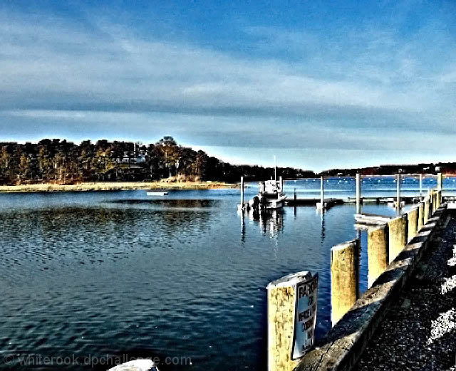
The improvement in your work is showing. I admire your perseverance. Practice will get you to your goal. Your almost there on the composition. A little tweaking of aligning it too balance out more will help. IMO. I agree with another commenter that this looks like a painting. The only exception is the sky. This, I think brought your score down the most. The color and vividness is a great improvement from your earlier work. Keep it up. Good job.
I love it. I love the strong dark lines of the horizon and the edge of the pier, and the dark shapes of the water. The grittiness adds texture and interest to it. This is like a painting.
That is some funky processing. I like the idea and the overall look, but the detail hurts a bit. By "the detail" I mean all of those very small perfectly horizontal and vertical scratches (for lack of a better word). It has the look of some very aggressive post-tone-mapping Neat Image artifacting (I think I just made that word up).
Looks like it might be posterized? Certainly, it's interesting pp. Not sure I like the lose of detail, but nice comp, though next time you might aim for less sky or less water - rule of thirds, you know.
Afraid for me this is a example when less would have been more, the PP seems way too heavy handed. Pity on such and interested and well composed image.
Either this was taken with a high ISO or it was over contrasted by some means. there are a lot of bright spots pulling my eye all over the place. I would make sure your screen is adjusted and try to tweak the contrast a it.
nice treatment on this image - i like the bottom two thirds of the image a whole bunch, but the sky just seems too pixelated to me - still it gets a 6 from me
I think this has so much potential, but the processing seems just a tad much IMO. The sky seems quite "pixellated" (not sure if that is even a word). Great colors and composition though.





 Add photograph to your favorites
 Add photographer to your favorites

 Photographer found comment helpful.


