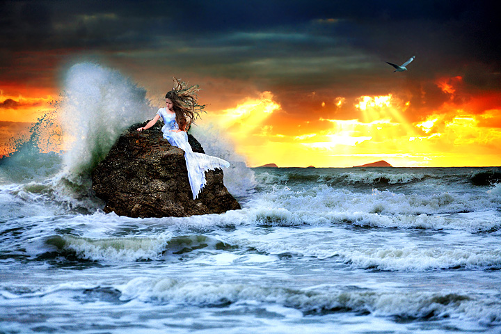
The entire image except for the mermaid was taken at the same time looking in the same direction. There are 3 images in there...all at different exposures but all from the same spot on the sand and the same time frame. The water splashing was as it shows....not swapped from another side.
The mermaid shot was taken on a rock 5 meters to the left of this one but facing the land. So she was between the land and myself on a rock that is about 6 foot tall. That rock was completely underwater in the splashing shot. but the lighting was the same for all images.
Maybe I don't know how to use PS. But at least I try.
BTW - This image only just reached a 6 score the day before finishing. It started with a 1 vote and continued to get many more.
Statistics
Place: 57 out of 308 Avg (all users): 6.3242 Avg (commenters): 8.1515 Avg (participants): 6.2391 Avg (non-participants): 6.3720 Views since voting: 2323 Views during voting: 618 Votes: 256 Comments: 64 Favorites: 11 (view)
I really am WOWED by this photography. I think the technicals for the most part are excellent and it's one of those, that I can't stop looking at. Great job.
What a freaking amazing photo! This is gorgeous. Good job on the editing. It gives it such a surreal flavor. I wish I got ideas like this (and that I lived by a beach!!). And can I say, I'm pretty proud I could tell this was yours! :)
The volume light is going in too many directions!! The wave should break from behind the girl same direction of the waves. The colors of the sky do not match. poor job of mixing the breaking wave with the clouds above it.
The light on the bird is coming from the wrong direction.
Powerful editing tools in the wrong hands. 1
Is that why you hate me? I did not know it was you. This is just a bad phots, as I said:Powerful editing tools in the wrong hands
Thank! So according to you I should quit photography and everything associated with it. I am obviously not as good as you. As you have implied in this thread.....only the elite like your images and the rest of us are not real photographers. And yet your score treats everyone like rubbish...even those elite photographers you rave about. And yet you claim to be able to pick all three winners of certain challenges as the only 10's you gave out...which means you gave everyone else ones.
The volume light is going in too many directions!! The wave should break from behind the girl same direction of the waves. The colors of the sky do not match. poor job of mixing the breaking wave with the clouds above it.
The light on the bird is coming from the wrong direction.
Powerful editing tools in the wrong hands. 1
Is that why you hate me? I did not know it was you. This is just a bad phots, as I said:Powerful editing tools in the wrong hands
Count me among your fans on this, Judi. I think it's spectacular. I don't understand where the mermaid was shot, though - on a rock that was underwater when you took the other shots? Hmm?
The DPC score, and much more so the histogram, shows a community still very divided over this style vs. "normal" photography. Regardless, this is a fantastic piece of art, so be proud of it!
So you went all the way with this and caused a bit of a stir for yourself. Not a bad road to travel at all if you ask me. Prompting a response, good or bad is alot better that going unnoticed wouldn't you say. In the end you've got an image that I'm sure kills in full size and demonstrates your ability to present YOUR visions in YOUR way beautifully. In short, you are one who CAN.
TIHadi
The volume light is going in too many directions!! The wave should break from behind the girl same direction of the waves. The colors of the sky do not match. poor job of mixing the breaking wave with the clouds above it.
The light on the bird is coming from the wrong direction.
Powerful editing tools in the wrong hands. 1
Those that CAN, DO and those that CAN'T... insult and criticize. As I stated earlier, 'Prompting a response, good or bad is alot better than going unnoticed'. Ask Mr. TIHadi to explain that to you... he's very well acquainted with going unoticed and his opinion has as much impact and depth as his images do.
Powerful editing tool in the wrong hands... perhaps... :P
I'll take his opinion more seriously when HIS images do more than simply occupy space... and so should YOU!
Rd
I was also curious to see how the digital art vs photograph debate would play out with your shot. However, I have to say despite my affinity for a more traditional style I gave you my highest vote.
I just couldn't deny the skill it took to create this image so seamlessly. I'm shocked it didn't score much higher. Great work!
I love it and I feel it is very photographic. Nice work! It is too bad that those who can't...hate. But what are you gonna do some are just jealous I guess.
Judi - I think you used Photoshop quite well on this. It's a wonderful piece of art. However, that being said, I also think this seems too much like a digital graphic that goes over the edge of maintaining photographic integrity.
You had a wide range of votes on this and I think the DPC community is still trying to decide whether 'Expert Editing' is a good fit for what's been more or less fairly traditional photography for the past several years.
Curious about your comments, I read them all...definitely some strong reactions to go with a strong photo. Well, at least no one is ever going to say the photo is "dull" or "boring"...Right?!!! ;-)
I never expected this picture to be yours. Not your style of images but like I said during voting, This is very good editing and you took this to the max. Good Job Judi.
i thought this was the winner for sure Judi... so disappointed. Dont let the anti-post processing hawks get you down, you were one of the few who really took full advantage of the expert editing!
I was curious as to where it finished...I told you I thought it was great and didn't contribute to the outcome because I only commented. I don't see much wrong with the image itself. I don't get the negative comments related to simply the image. Oh well..
I never EVER give one's. You would be shocked if you saw where the red line was. Just because I didnt agree didnt mean I gave it a 1. If you msg me I will screen cap and show you what score I gave you.
I apologize if I thought you gave a one. Regardless of what you gave...I respect it...! I am not angry with you...but I wanted to explain why I didn't mark it as helpful, as I don't agree with what you wrote. But, that's not to say that I don't respect your opinion.
First of all, this is not a landscape, its a seascape. Its overprocessed and DNMC. It is a beautiful image tho.
That is your call. There is land within the shot. It is a landscape. But that is my opinion......not yours. I respect your vote of 1, I don't agree with it...but I do respect your choice.
I never EVER give one's. You would be shocked if you saw where the red line was. Just because I didnt agree didnt mean I gave it a 1. If you msg me I will screen cap and show you what score I gave you.
The volume light is going in too many directions!! The wave should break from behind the girl same direction of the waves. The colors of the sky do not match. poor job of mixing the breaking wave with the clouds above it.
The light on the bird is coming from the wrong direction.
Powerful editing tools in the wrong hands. 1
You are so wrong. The entire image except for the mermaid was taken at the same time looking in the same direction. There are 3 images in there...all at different exposures but all from the same spot on the sand and the same time frame. The water splashing was as it shows....not swapped from another side.
The mermaid shot was taken on a rock 5 meters to the left of this one but facing the land. So she was between the land and myself on a rock that is about 6 foot tall. That rock was completely underwater in the splashing shot. but the lighting was the same for all images.
Maybe I don't know how to use PS. But at least I try. You get upset over someone giving you a one...well I think you need to explain to the public why you felt that my image was so poorly done that it only deserved a one.
I personally would like to challenge you to a showdown of the same technique and conditions. Put your money where your mouth is.
First of all, this is not a landscape, its a seascape. Its overprocessed and DNMC. It is a beautiful image tho.
That is your call. There is land within the shot. It is a landscape. But that is my opinion......not yours. I respect your vote of 1, I don't agree with it...but I do respect your choice.
I find this photo wonderfully dramatic and beautifully composed. Originally, I gave this photo a 9 and will not change that score, but returned to comment because I think the post processing is astounding.
Well if you are going to go all the way with editing as done here I would have wanted to see it better done. It´s not bad at all but the lighting of the water and especially the girl is not very convincing when you look at the scene. Her hair is poorly masked out, I know that is the hardest part but it´s not done well enough.
Result is a 5 vote from me as I can´t say if I like it or not.
the hair and the wave and the sun make this for me … and the bird … and the rock. … and the colors. Did I mention that I like the hair? The light seems a bit strange but you must have used a powerful strobe ;]
Wow! Amazing! It looks like a painting. How did you manage to ever get everything just right with the lady's (mermaid?) position and blowing hair, crashing wave, seagull, sun? Since this is expert editing is it multiple images superimposed? 10
The volume light is going in too many directions!! The wave should break from behind the girl same direction of the waves. The colors of the sky do not match. poor job of mixing the breaking wave with the clouds above it.
The light on the bird is coming from the wrong direction.
Powerful editing tools in the wrong hands. 1
It's nice to see the expert editing rules in the hands of someone who really knows how to take advantage of them to produce an outstanding result. Very nicely done.
ABSOLUTELY PERFECT. The landscape witha midground subject. Expert editing, so you were creative and very original. I can't thank you enough for breaking up the monotony of "landcape" with something that tells a magnificent story. 11!
about time someone did some advanced processing - some of the photos I've voted on look as if they would fit in a minimalist editing challenge.
I like the drama you've got going on here, only issue is that the OOF waves in the foreground dont fit in with the hyper processed feel of the rest of the photo
You should have really saved this for the free study. You would have won. So even though this is a truly masterful image, this is not a landscape shot. I am not voting so don't worry, I just wanted to pass on a comment.





 Add photograph to your favorites
 Add photographer to your favorites

 Photographer found comment helpful.


