RSE 2006
- convert to TIFF at 4 exposure compensation settings (-1,0,+1,+2)
Photomatix Pro
- generate HDR/Tonemap (detail enhanced, tone mapped)
PSP X
- open detail enhanced (DE) TIFF generated with Photomatix
- straighten
- duplicate bg
- smart photo fix (30,20,0,18,83,1,0)
- duplicate layer
- brightness & contrast : clarify +20, set layer opacity to 48%
- open tone mapped TIFF generated with Photomatix
- copy and paste as new layer into DE image, set opacity to 24%
- merge all (flatten) layers
- crop
- duplicate bg
- brightness & contrast : histogram (0,1,220)
- duplicate layer, set to burn mode, 12% opacity
- merge all (flatten) layers
- color balance temp (4200)
- resize
- USM (.35,100,10) +luminance
- border
- save as JPG
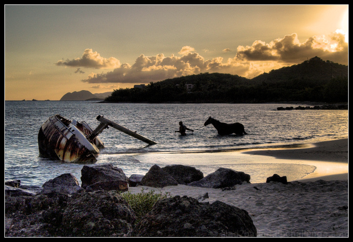
Taken while on vacation in the U.S. Virgin Islands (St. Thomas). I wish this challenge wasn't "expert editing" as I'm worried some may think the man and the horse are photoshopped in.
This is a sunrise photo. There are several boats just washed up on the beach (I counted 4 total) that have been abandoned by the owners (too expensive to repair I was told). The horse is a local race horse. Later, I was told the handlers bring them down for exercise in the morning by swimming them in the bay. Certainly fun to watch. This shot was actually a last second grab. I was walking back to the car to call it a morning at this location and there they were. Thankfully I had 3 or 4 shots left on the memory card because I didn't have but a moment to think about grabbing a couple of photos!!! :D
I have high expectations for this photo...hopefully I'm not setting myself up for a crash and burn. :P
Statistics
Place: 50 out of 573 Avg (all users): 6.5027 Avg (commenters): 8.2000 Avg (participants): 6.3561 Avg (non-participants): 6.8824 Views since voting: 2248 Views during voting: 273 Votes: 183 Comments: 17 Favorites: 6 (view)
I think that this is a great image. Great timing. Well caught.
By way of constructive criticism, it appears soft and grainy in the foreground shadows and the light is a little past its best (I know that you were not in control of all the elements - but the viewer is not to know that). The light in the background is a little flat - with a silhouette, that becomes a little more significant.
You may not appreciate the comment, but given that this was an expert challenge, you had the option of chopping the sky for something a little more dramatic taken a bit earlier or later.
The waves look a little oversharpened or perhaps the detail is lost in the size retriction. Something I am facing up to more and more so is the need to selectively sharpen different elements of the image to different degrees.
Cheers! M
Thanks for the comments Matthew. It's rare for me to address comments within the photo thread, but since some of the comment seems to be based on (initiated by) the Thoughts about 'digital art' thread I will. I'm quite tempted to reply to the forum thread but I'm about "talked" out in there and don't need to rekindle it. :)
First, (in response to thread comment) I'm very pleased with the score and final outcome of this image. No regrets or disappointments.
As for using the expert editing option of "chopping" the sky - that's not my style, and wouldn't be a true representation of the scene as I captured it that morning. Besides, I'm quite pleased with the sky as is. I like the balance of the clouds with the hills, and IMO anything much more dramatic could be distracting and take attention away from the primary subjects. Different strokes for different folks I guess. :P
Thank you for taking the time and effort to comment on this photograph. Your portfolio indicates to me that while all comments are worthy, yours has exceptional merit. It's very much appreciated.
I think that this is a great image. Great timing. Well caught.
By way of constructive criticism, it appears soft and grainy in the foreground shadows and the light is a little past its best (I know that you were not in control of all the elements - but the viewer is not to know that). The light in the background is a little flat - with a silhouette, that becomes a little more significant.
You may not appreciate the comment, but given that this was an expert challenge, you had the option of chopping the sky for something a little more dramatic taken a bit earlier or later.
The waves look a little oversharpened or perhaps the detail is lost in the size retriction. Something I am facing up to more and more so is the need to selectively sharpen different elements of the image to different degrees.
This is a very beautiful image, and a great title to go with it. I must say, I don't really know what to say about it, except that it is very good. The tone-mapping suits it perfectly, it doesn't look overdone, the composition/presentation are spot on.
Possible negative: The light is a tad funny, but I think it is a result of tone-mapping combined with reflected light. Actually, I don't think it's funny at all, but it might have put off a few people.
I don't know what else to tell you. Be proud of a good picture :) And, I hope you enjoyed your vacation.
Wow, what a stunning photograph.
I've stared at this for a while, trying to find something, anything i don't like to try and give a helpful comment, but i can't.
I don't say this very often, but, 10, perfect.
this would have been great with just the boat on its own but the inclusion of the man and horse makes this really interesting!!
From a technical sense the lighting seems a bit strange as the boat had colour but the horse and man are silhouettes, makes me wonder if this was done intentionally in photoshop as it looks a bit unnatural. Other than that, great composition :o)
Beautiful shot, I love the dynamic between the nicely textured boat and the sillhouette, it seems a bit busy though, I think it might be nice to either crop it and have the boat as your subjet or the person with the horse as your subject. How it is right now I am not sure what I am supposed to focus on.







 Add photograph to your favorites
 Add photographer to your favorites

 Photographer found comment helpful.