Thanks to my friend Alric for giving me the idea for the challenge.
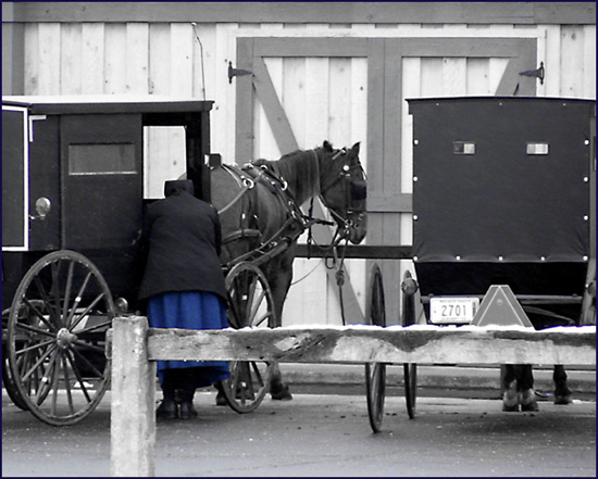
Took a road trip to Nappanee a few miles away looking to catch some nice candids. I knew town would be busy, since the Amish do their shopping on Saturday. Caught this lady as she was leaving the grocery store.
Cropped, adjusted levels & contrast, desaurated all but the blue, slight gausian blur, USM, 2 pixel border, and that's it.
Hope you like it.
Statistics
Place: 88 out of 262 Avg (all users): 5.6128 Avg (commenters): 5.4444 Avg (participants): 5.1913 Avg (non-participants): 6.0167 Views since voting: 2190 Votes: 235 Comments: 13 Favorites: 0
This was a good idea! However, while it meets the theme topically, it doesn't meet it compositionally. The composition is crowded, and while there is a focal point (the person), they are partly obscured, bent over the other way, and facing the other way.
IMHO there were a number of ways to approch this. The key would have been to reduce the number of elements in the photo as well as capturing a portrait of the simple life. On the other side of the post would have been a good start. Catching just the one carriage, perhaps even as she pulled away, would have worked as well.
Where are you from? I have Amish relatives all over Indiana, Ohio, Michigan. I know for a fact that they she did not know you were shooting her! On a tech note, your focus is a little soft and I don't think the selective desaturation works here. You did hit the challenge on the nose though!
TC
The connection between Armish-people and simplicity is very straight foreward and thus well choosen. The image itself however is somewhat crowded: one carrige might have been better. Also pure B&W might have been a better choice, because the blue dress attracts the attention of the viewer first, but the dress isn't of interest, or is blue a special armish color? Also, what happend to the head of the wommen, looks like being cut off.
Too bad the fence is there. This is a potentially great shot - would like to have seen the person turned around. I like what you did with the b&w - but left the blue.
Yeah, really a simple and interesting shot. I would prefer to no see the blue colour in your composition. So, it´s a good picture and meets the challenge very good. 7
Personally I feel this shot would be better in full black and white, to me black and white with a bit of color is only appropriate when a key element of the photo is highlighted in color, in this case, I don't feel that the skirt is a key element or a main focal point and draws attention away from the horse and carriage. 6
The lean in the foreground is a bit distracting for me, but this is a very nice composition. I wonder why you have desaturated all colours except blues. I think a full desaturation and sepia tones would have made it, too. :-) Just an opinion.
Technical: Most all images submitted fit the challenge. This does well. Exposure composition focus lighting all good, though for me the selective coloring doesn't add anything to the shot.





 Add photograph to your favorites
 Add photographer to your favorites


 Photographer found comment helpful.


