Author Thread Comments Made During the Challenge
Post actions
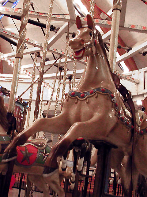
I have seen more colorful carousels. This however, is a very nice shot. I would like to have seen more color, but I like how the focus is on his head. Angle is nice and definately depicts childhood to a T. great shot and good luck in the challenge.
Post actions
This one is way to busy for me. The glare on the horse is really harsh. and you cut of its back end. 3.
Post actions
This is a great shot. My only gripe, and I'm not really sure how you could have cured it, is that the lighting seems a little harsh…
Post actions
Composition: Subject Placement, Cropping, Background7,
Post actions
Good subject matter. Presented well. Lighting is OK. Focus looks pretty good.
Post actions
Nice photo. Like the low viewpoint but not the tilted angle.
Post actions
This actually looks kinda scary.
Post actions
Nice attempt on the part of the photographer and meets challenge, unlike several photos I've seen here for this challenge that don't.
Post actions
the background is too busy for me.
Post actions
Great angle, it captures the motion. The colors are a bit mottled on the horse's coat, but the picture itself is very nice.
Post actions
Jpeg artifacts up the wahzoo! Too distracting to enjoy the angle of the shot.
Post actions
I think it's a great shot. It would have been perfect if the background wasn't so lit up as all these beams and sticks distract from the horse.
Post actions
I think more focus on possible the head of the horse, and less of the background would have made this pic more powerful. Though the vertical lines give an "upward" feeling to the pic, they do so at the expense of drawing the viewer away from the horse, I think. karmat
Post actions
I like the idea, not sure if the backgound, although interesting, helps the composition.
Post actions
This photo has a LOT of ccd noise in it. 3 -lennier





 Add photograph to your favorites
 Add photographer to your favorites


