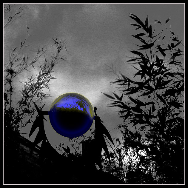
Rusty iron and bronze sculpture with bamboo in a studio garden near where I work. Oblique backlighting led me to take it first to grayscale using one Curve and the Channel Mixer in PS 5.0.
Then I decided to try and accentuate the sphere, so I created a feathered mask for it, which I then used as a mask for a Curves adjustment layer, and turned the ball into a neon-glowing plasma ball kind of effect.
In experimenting with further modifying the Curves mask, I duplicated the adjustment mask and applied another Curve to it, which made the barely-visible dull reflections suddenly pop out.
I modified that mask a little more to ger rid of a bright rainbow ring surrounding the ball, and said "enough." I keep reading about people doing selective desaturation; I found it interesting to take a scene essentially gray and colorize it.
General, I seem to be getting lucky and pulling your shots for critique!
For the most part I really like this shot. You have very nice contrasts. Round ball, pointy leaves. Stormy looking sky, somehow serene-feeling reflection in the ball. B/W background, blue object. I also like the silhouette effect against the sky. I also think that the title fits very well. (and I usually don't even think about titles!)
The thing I like most about the shot is the ball itself. I would never have guessed that you 'created' the color there in effect. I love how the reflection pops out of it.
You do have a couple of issues here that I believe affected the voting. First thing I noticed is the foliage on the left side of the shot has lost a lot of definition. This makes me stop and try to figure out what is really there (really unnecesary elements anyway), detracting from the rest of the shot. I have to 'think' about it too much. You also have lost a great amount of detail in the foreground of the shot (the rusty iron and bronze sculpture?) which also creates a distraction.
A different crop (or shooting angle) and/or some cloning to eliminate some unneeded elements and this shot would be the bomb!
TC
THIS A GREAT MOODY SHOT! oops! Sorry about the caps
I think all caps is fine in this case ...
Here's a link to the "original" image before applying the color effect to the sphere. The "Fractals" in the title refers to the bamboo branches and leaves more than to the pattern on the sphere. Overall I was happy with the response, or perhaps the lack of what I expected to be a "Too Digital Art!" response ... Thanks for your comments!
The bright touch of color in the midst of all this black and white gives this photo a three dimensional effect, and makes it jump right off the screen. Great work.
Hmmm. Interesting. What in the world is it? This is quite a fastinating picture, and I like the grain in it. Somehow I keep thinking that the reflection on the ball should be upside down from what it is. Weird.
Very dramatic photo. But IMO you went a bit too far in the post processing with this. Sometimes less is more. The blue ball stands out nicely against the dramatic surroundings, but it is almost distorted by pixelation. The colour looks strange (the greenish part). I've seen fractals before, but in your image I cannot really make the connection - it looks more like chaos (fractals are highly organized). Overall, not bad image, it caught enough of my attention.






 Add photograph to your favorites
 Add photographer to your favorites


 Photographer found comment helpful.


