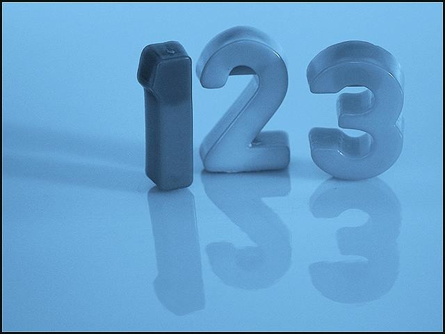
Just some plastic numbers. I really think the ISO was too high and caused the gain look. DUH. Didn't check it from a previous shot. My fault.
Model Canon EOS DIGITAL REBEL
DateTime 2003:12:06 00:23:02
ExposureTime 1/60
FNumber 5.6
ISOSpeedRatings 400
ExifVersion 0x30 0x32 0x32 0x31
DateTimeOriginal 2003:12:06 00:23:02
DateTimeDigitized 2003:12:06 00:23:02
MeteringMode 5
Flash 25
FocalLength 49.0
Statistics
Place: 62 out of 262 Avg (all users): 5.8194 Avg (commenters): 6.9167 Avg (participants): 5.6638 Avg (non-participants): 5.9820 Views since voting: 1232 Votes: 227 Comments: 12 Favorites: 0
I like the idea here a lot, but I do wish the numbers could either all be the same tone, or be three different tones. The 1 stands out too much for my taste. I keep wanting to see the numerals as ice cubes -- which means, to my mind, you've done a good job toning to change one set of objects into another set in the viewer's eye. Good luck.
Overall interest : 1/3
Technical : 3/3 (I like the simple effective setup, the reflection)
Challenge fit : 2/2
Wow factor : 2/2 (color scheme and perfect setup)







 Add photograph to your favorites
 Add photographer to your favorites


 Photographer found comment helpful.


