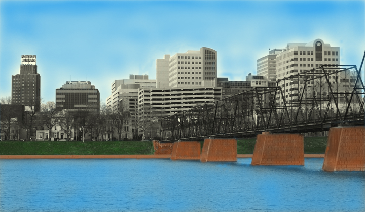
I'm still very new to Photoshop so I was glad to have an expert editing challenge. It looks a little cartooney, but I don't really know what I'm doing yet anyway. Converted from raw, desaturated, and I adjusted curves, used a layer mask to bring out the colors.
Statistics
Place: 258 out of 308 Avg (all users): 4.9474 Avg (commenters): 4.0000 Avg (participants): 4.7957 Avg (non-participants): 5.0289 Views since voting: 772 Views during voting: 379 Votes: 266 Comments: 20 Favorites: 0
As I said in my original comment, the colours are great in this shot. Vivid blues and greens, with nice, crisp grays in the buildings.
Generally, this looks like a drawing. The blue looks randomly painted in the water, with some spots beings less saturated than others. The sky is the downfall of this shot, as it looks like the blue was painted in with an air brush. The haloing around the buildings, as someone mentioned during the challenge, is distracting.
Lines and composition are good. If I were you, I'd look through all of the comments you've received so far and take them to heart. It really *does* look like a screenshot from a video game, or like something put together in Maya.
Not a bad shot, but I've got to ask: is this what you saw when you took the image? Did you reproduce the original scene in a way you wanted to?
Sorry but I can´t put my finger on it, this shot looks like more a screen shot from a computer game than a photograph. Probably the coloring and the halo around the houses. Anyway, the look is not to my taste and this shot got a 4 from me.
The pp on this gives an effect of this being an assemblage of clip art, rather than a real photograph. The dodging and burning in the sky and on the edges of the buildings is very distracting as well.
I'm not a fan of the over the top pst processing here. I'm not an advocate of the new rules but this is an abuse of it. This picture would porbably have been great without it to be honest.




 Add photograph to your favorites
 Add photographer to your favorites


 Photographer found comment helpful.


