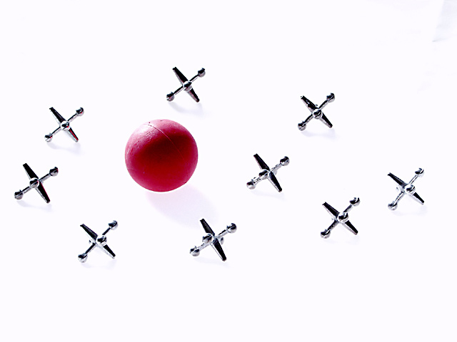
the items are lying on white sheet lit from below. they're also light from the side/rear. this shot is straight out of the camera,then resized and sharpened, and then delivered fresh to you ..
Statistics
Place: 17 out of 172 Avg (all users): 6.2976 Avg (commenters): 6.9444 Avg (participants): 6.1550 Avg (non-participants): 6.4472 Views since voting: 1607 Votes: 252 Comments: 36 Favorites: 2 (view)
Definetly one of my favorites. Simple, uncluttered, and very nice. The shadow up in the right corner is surprising. Wish ya woulda gotten rid of it. Still very nice. Grayce aka Gracious
Nice lighting. You came very close to completely eliminating the shadows which makes the whole scene seem like it's floating. Having them all on one plane and shooting from this angle adds to that effect. It's simple, clean, and high-key (the opposite of my submission this week). I like the subject, and it is technically very good. It would make a nice stock shot, but for some reason it doesn't have a lot of emotional pull for me. ~indigo997
This looks like it either had some upload problems, or it was post edited way too much. I am leaning towards post editing because there are shadows on some of them, but the shadows are washed out on the others. I know this is sometimes done to "erase" the background and if this were the case, you definately did a good job of erasing the background. There is a blemish of some sort up in t he upper right corner, but other than that, the angle is great and lighting is good. I like how there are no shadows on some of them, but i would like to have seen no shadows on all of them, but that would probably take a lot away from the photo. Good job and good luck in the challenge.
I like this. The white works well here. A couple of wrinkles in the cloth should be hidden. layout is good, color is good. But the jacks all seem to be facing in a uniform direction. I wonder if it would add a little pizzaz to random the positions a bit? - Good Luck, 8 (Gotcha)
If this was a white background, I would have liked to see some shadows, I suspect you bled out the contrast. The ball looks great - red on an otherwise b&w photo.
A bit stark, don't you think? (as in bare) Your elements are very clear, but to me, an activity needs motion or the more story to explain the game. Anaseptic 7 Swash
Clean and simple. I love the lighting. Something about the composition throws me off a little - I think it's the way everything seems to be bunched towards the center horizontal. I really like this perspective on "childhood". lhall
There was another "jax" picture here, it was placed in a realistic setting where as this is a "studio-type" shot. You'd think that I "should" like the natural setting picture more. For some reason, I find this more appealing.
Normally I like stark images like this one, but for this challenge, the harsh "clinical" approach leaves me wanting childhood's sense of warmth. I think it would help to adjust the jacks so that they appear more random: the Xs these make are almost identical.








 Add photograph to your favorites
 Add photographer to your favorites


