Author Thread
Post actions
Comments Made During the Challenge
Post actions
Post actions
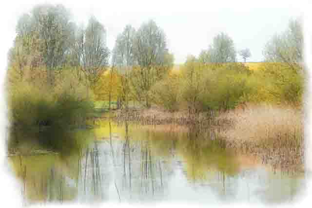
this is a loverly water color effect
Post actions
Sorry, intentional or not, the strong pixelation just doesn´t agree with me, I want details and texture when I look at landscape photos. 3 from me.
Post actions
Nice shot but too processed.
Post actions
This picture could be improved by increasing the contrast. Also I would use another way to resize this image. (Personally I like BDSIZER (a free program))
Post actions
I would rather see the original photo.
Post actions
this reminds me of Bob Ross!!! (that's a compliment...)
Post actions
The border is a bit distracting. Hard to tell if the pic has a painting/filter effect or it's just pixilized...
Post actions
It just looks to me like you lowered the resolution to about 80x80 and made a vignette. It has somewhat of a Van Gogh look, but doesn't knock me over
Post actions
Nice colors, tones, and watercolor effect. But I wish that there was a little more detail so that it didn't just make my eyes feel like it is out of focus, or not fully rendered. This impression may have more to do with what appears to be a lot of digital artifacting, rather than the image being OOF or abstract.
Post actions
Cool idea, but the yellow seems way too strong... Almost makes it look stained, to me. Otherwise, I think would've like the coloring, and I like the simple (but effective) faded border.
Post actions
An interesting take on the challenge! Probably not to a lot of voters' tastes but I like your creativity.
Post actions
Post actions
Nice pastel/watercolor effect. Very strong comp using rule of thirds. I like your border treatment as well.
Post actions
This is almost like the focus in a Monet paining but very effective...7
Post actions
Just like a painting.....
Post actions
Very pixelated and.. not sure about the fade in sides
Post actions
I see that this is like a beautifull watercolor painting...but i dont enjoy the pixels.
Post actions
i am not a fan of this treatment in processing 4
Post actions
More detail could have made this nicer.
Post actions
Lovely, I wished I could see more details.
Post actions
A greeting card is in here love the effect
Post actions
Umm... over edited with a strange border. Very out of focus and poorly exposed. I'm afraid your post processing has made a poor image worse.
Post actions
Doesn't work for this. Nice idea, though.
Post actions
whoa. not quite my style. I almost thought it was by accident until I saw the title. 5





 Add photograph to your favorites
 Add photographer to your favorites


 Photographer found comment helpful.


