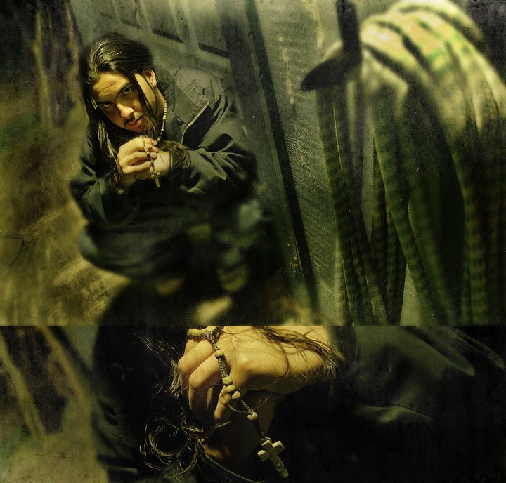
I love how you've combined the two parts of the shot and processed this - has a "can't put my finger on it" feel that I really like. Sort of a questioning hopefulness, maybe. At any rate, I like it.
Shocked to see this score so low. I think the avg score from the commenters is more what this deserves (course I would say that, being one of the commenters).
Seems to me like you would have had a much higher score if you had just entered the top photo. I guess I can see that point of view but I actually liked how the two photos blended (and didn't blend) together. I also recognized this as yours because of the thin-strip photo thing that you do. I think it is terrific. Guess it's a love it or hate it kind of thing.
and I'm not sure what people have against garden hoses. It's all about the setting and the atmosphere...
Pretty cool! :) Not fond of the bottom photo - or maybe it's the abrupt merge of the two images. The top photo is outstanding and the processing first rate. Good luck.
Highly original, and there's a lot to like here. The stark lighting, green color-cast, high angle, and crouching model all work very well together to create a disturbed/troubled feel. But I don't get the ropes in the foreground. They attract significant attention, but don't really say anything to me. Also, the accidental alignment of the head in the lower panel and the shadow in the upper panel is distracting (would have been less distracting in a separated diptych). But all in all, impressive work!
Technically very good, especially the toning. However I find the crossover between the two images too abrupt. I like where you are going here, but that hard line between the two with different sharpness values is a little off putting.... otherwise very cool!
Nice sue of the editing rules. Has a grunge feel. With the bottom piece taking up the bottom 3rd its a bit distracting. Its harder to pull interest to where the subject is although i think its in a perfect place. But the secondary is a bit hard cut and placed into the square area drawn through all the outer blocks. So it kind of draws your attention off. Once you step back and look at them separately it does work okay. IMO







 Add photograph to your favorites
 Add photographer to your favorites

 Photographer found comment helpful.


