This needs a better title...like "Sittin' at the Dock of the Bay" or something.
Many entries in this competition use the word simple in the title to force the viewer to think the photo fts the challenge. This should not be one of them. No points deducted for that.
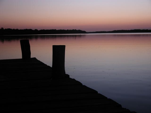
I like the simplicity of the light and colors and composition. I like it this dark - it simplifies the forms. I wish there was more light space between the left hand post and the reflection of the trees in the water.
Technical: Most all images submitted fit the challenge. Exposure composition focus lighting good. I like the colors, looks like dawn.
Personal: The crooked horizon bothers me, and I wish that there was either more visible detail in the pier or that it was a complete silhouette. As it is it's distracting.






 Add photograph to your favorites
 Add photographer to your favorites


 Photographer found comment helpful.


