I learnt a lot about lighting when doing this shot. Thanks to everyone who helped me out, especially those folks on the DPCFanatic's chat!
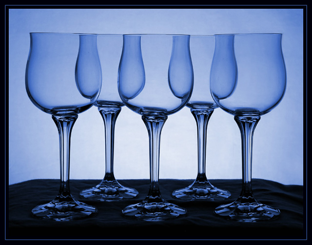
Setup glasses on a table with a white sheet(yea that's a white sheet). On the wall behind is a white sheet. I lit the white background with a single desk lamp below the table. Then in photoshop adjust levels, hue, neatimaged, border and done! Pretty simple all together.
Statistics
Place: 3 out of 125 Avg (all users): 6.8794 Avg (commenters): 7.7368 Avg (participants): 6.8395 Avg (non-participants): 6.9333 Views since voting: 5108 Votes: 141 Comments: 40 Favorites: 10 (view)
hey lee its been a while since ive been able to see some of your stuff. this picture is amazing your definatly going some where big with this little hobbie of yours. miss talkin to you
k8
A couple of notables on this picture. 1). the height of the lens was spot on.....as the glass rim heights are all equal. 2). the duplication of the primary color from the photo, in the 3 pixel border sandwiched between the 2 black borders, works very well. I am quite a fan of this particular process of bordering. Good job.
fantastic shot- so eye pleasing- you are proof that a great shot can be taken in a kitchen- with ordinary things- and a big dose of creativity adn skill. Nice job
Realy nice work with the lighting. Congratulations on your best ranking.
Would realy like to see the same shot with these glasses arranged in a little more chaotic way.
Many shapes happening here that are similar. Like the color and the sharpness is right on. The frame helps to keep you in the photo (especially at the bottom). 7
The way the shapes of the glasses interact at the overlap points is ingeresting. I'd have liked to see more light on the bases, they seem to get lost in the black background.
Lovely and very carefully composed composition and lighting. Interesting how you've staggared the glasses yet still lined up the tops into a single continuous line. Great work with the glass, keeping reflections low, also. 8
The shapes defined by the overlapping curves are interesting. I had an idea fthat was similar to your image or this challenge a while back. I might try to recreate it later. Good job!
That border looks familiar. this is a sensuous photo trick. I like the "blue tone hue" as well. very nice shot- i wouldn't be surprised if you pull a ribbon for this shot- you have my vote you creative person.
I think this is a beautiful composition. After going to the trouble to set this up, I would have considered making the surfacr horizon uniform on both sides also.
Very nice! Would love to see a print of this one when the challenge is over...it would go great in my kitchen! :-) Love the colors and the border, the only thing I don't care for in this shot in the way the black fabric is draped on the right side, wish it had more of an angle to it like on the right side. Still a beautiful shot. 9





 Ornate
 Add photograph to your favorites
 Add photographer to your favorites

 Photographer found comment helpful.


