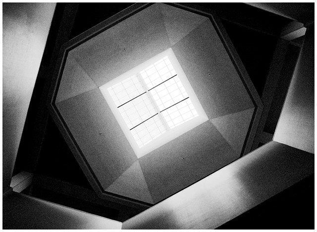
Thrid straight black and white entry, the color version was too monochrome for my taste. You might have seen a similar photo in my portfolio titled "UCB".
No real adjustments madehere expect for playing around with the tone adjustments and sharpening it a bit. Besides, I'm pretty limited skillwise when it comes to this sort of stuff. There is a ligther version that I made, but I like the look the contrast and lighting gives off in this photograph more.
Statistics
Place: 24 out of 125 Avg (all users): 6.1690 Avg (commenters): 8.1000 Avg (participants): 6.1000 Avg (non-participants): 6.2581 Views since voting: 1650 Votes: 142 Comments: 13 Favorites: 3 (view)
I never found the time to vote on all the images in this challenge, so didn't seee half of them, and this fell into that category ...
I adore this: almost perfect of its type. The progression of tone and shading, and reflection is superbly controlled - I'd guess that all 256 shades are present somewhere or other (OK - just checked, and I'm right). Only two things to suggest, really: have you tried this kind of work in a partially de-saturated (as opposed to wholly desaturated) image? The reason is that it gives you so much more tonal range to play with - as an example, in my Spoon shot there are 10003 colours used - in this, as I've said, there are 256.
However, the graininess in the areas of the balconies and the skylight surround is so effective here that it doesn't actually matter.
The only other comment is about the symmetry of the image: I think I'd have tried to get an exactly symmetrical framing - here the skylight and its frame are placed a little high in the frame - so that the lower right wall that breaks that symmetry is that much more effective.
But those are minor points really: this is top work, and you should be disappointed with your finish for it. I might just put it straight into my favourites now.
I wasn't laying on my back, if I did that people around would've thought I was nuts lol. What I did was three quick shots with the camera pointing straight up while acting I was looking for something from my backpack.
I've had to hold off on commenting on this one so I could come back to it a couple of times to look at it again. At first I thought it was more "form" than "shape", however, the lighting makes the image feel "flat" so that it ends up looking like an image of geometric shapes. The black and white is absolutely perfect for the presentation of this shot, and for me, has very pleasing tonal range. 9






 Add photograph to your favorites
 Add photographer to your favorites

 Photographer found comment helpful.


