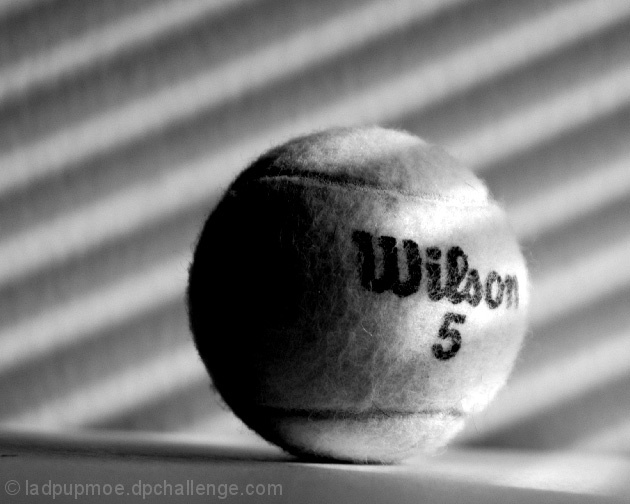
There are many compositional elements that I like in this shot. You have a couple of great contrasts here. Round/Straight, Light/Shadow, Smooth/Fuzzy-Textures, Black Letters/Light colored ball.
There are also a couple of elements that I think could be improved. A B/W shot like this I am finding come out with more impact if they have a little more contrast. This would help to further define the roundness of the spere. If you had a (very slightly) deeper DOF you would also accentuate the sperical qualities and also bring out even more of the fuzzy texture. Also I'm sure you noticed as did several commentors, your shot is slightly crooked. This is an easy fix in PS.
All in all a very nice study type of shot that with a little tweaking could be a great one!
TC
Great use of lighting. I don't know if is caused by the shadows, but it look as though there is a slight slope going left to right on where the ball is resting.






 Add photograph to your favorites
 Add photographer to your favorites

 Photographer found comment helpful.


