Shame about the expert editing coming when I didn't really need it... Not that I'm an expert editor. Did a little selective editing just for kicks.
curves
selective blur (foreground)
brightness (foreground)
border
resize for web
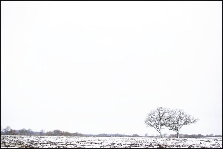
This is, essentially, the shot I set out to take. We had a snowfall and a cloudy day, and I knew this was the one chance to get a landscape before it all turned back to mud the next day. Pretty happy with it, though I went back and forth on how white to make the sky. This was about in the middle of my options.
Statistics
Place: 230 out of 308 Avg (all users): 5.1776 Avg (commenters): 6.6667 Avg (participants): 5.0215 Avg (non-participants): 5.2651 Views since voting: 1010 Views during voting: 394 Votes: 259 Comments: 24 Favorites: 0
Wow. This is truly a very good shot - love the minimalism and the stark, dreary sort of atmosphere conveyed. Yet it has a quiet loveliness to it as well. Score is way off the mark in my opinion. That of your commenters is much closer to what it should be.
Positives: Very, nicely done minimalist composition. It has a black and white feel, not surprising for a snow image, but conveys the sense of winter, and specifically Wisconsin winter, exceptionally well.
Technicals: The choice of framing is excellent. Looks like the leftmost tree matches the rule of thirds, but having both trees with the rightmost one to the right of the rule of thirds adds even more to the starkeness of winter concept you were after. The stark white background and minimalist concept works well with this composition adding greatly to your main subject. Sharpeness is good for this scene.
You chose to highlight aspects of the scene that support your theme. Whether by accident or design everything comes together to make this a fine composition. I particularly like the snow plastered to the trees brought on by previous blizzard conditions.
The Challenge: Obviously meets the challenge. I'm never surprised by that nor do I think this or very many other images ever fail to meet that goal.
Technical photographic quality, especially the use of minimalism, is a strength in this composition. It got a 5.1 which is well below DPC average scoring. That might be because it did not have a lot of color and detail expected by most DPC landscape voters.
This is an image I'm pleased to have disagreed with voters on.
Suggestions: Other than maybe going full B&W I do not have a single suggestion to improve this image, which is the final question I ask before giving an image a 10, and I'm debating that thought.
Well I do like the composition and that negative space. However, having no texture whatsoever in the sky hurts the image a bit IMHO and why not make it completely black and white since there are so little colors in it to begin with? Gave it a 6.






 Add photograph to your favorites
 Add photographer to your favorites

 Photographer found comment helpful.


