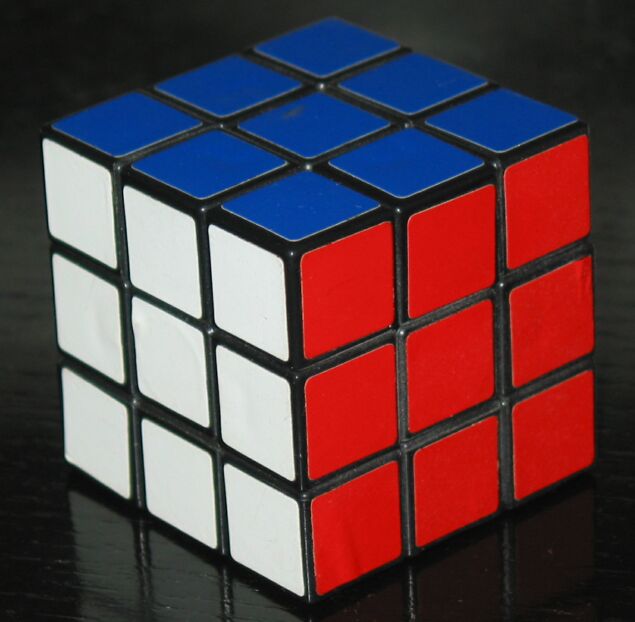
I would like to see this with more depth of field so the rear corner isn't out of focus. Also, try to keep the edges straight with the sides of the picture and it becomes a more powerful image. I like the slight reflection in front and would like to see a little more of it.
Well, well, well, a Rubic-cube, I like it! :-) Colours and shapes are simple, maybe I would have chosen a darker level in PhotoShop and crop is too tight on the bottom, otherwise a good pic and I like it. :-)
Complexity with the appearance of simplicity. Good dichotomy. I just don’t care for the angle of the cube or the cropping. I think it needs more buffer space around it. Nice shot, but nothing special..





 Add photograph to your favorites
 Add photographer to your favorites


 Photographer found comment helpful.


