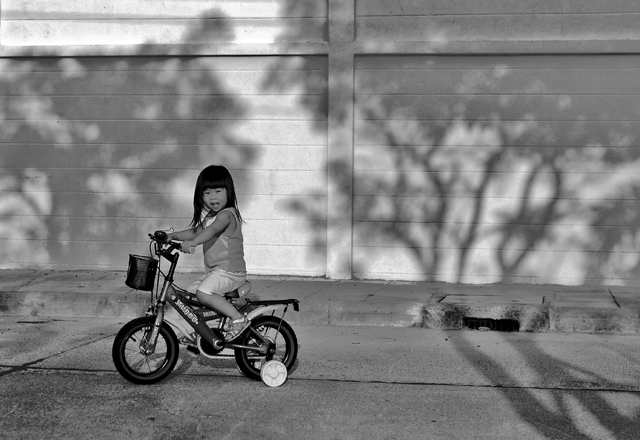
Perhaps nitpicky, but I'd put the negative space in front of her; the direction of the bike leads your eye out of the picture to the left. Otherwise a great shot, very cute.
Good BW: subject stands out against background; wonder if a closer crop, leaving out the upper cross line and the righthand third wouldn't make this more effective even at the expense of the nice tree shadow - think you would still get the feel of the tree shadows which is what brings this out of the ordinary.
Technically the shot would be stronger if there were not quite so many strong lines in the background which tend to distract, and if the little girl was on the right cycling 'into' the picture, instead of cycling out of it. I do like the shadow of the trees though and you have a very pretty model there so I am sure you can get plenty more pictures of her.
I think that this would be stronger if you'd cropped out a lot of the right side ... b/w conversion seems to be lacking contrast especially in the street and wall ...
IMHO i think it would have worked better with your cyclist ;-) on the righthand side traveling into the space to the left. Works well in B&W with the shadows behind.





 Add photograph to your favorites
 Add photographer to your favorites


 Photographer found comment helpful.


