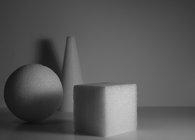
Taht's a great concept! Acctually I had something simillar in mid but didn't do so. I like the structure of the bodies and how the light and shadow play on them (for instance the shadow of the cube on the sphere. What I do not like so much is the shadow of the cone in the back: it's not well defined, not sharp and hence should have been avoided. Also the open space on the right is not necessary IMO: a quadratic cropping might have been OK too.
Anyway, your submission fits very well to the challenge and for me it's an 8
+Composition is interesting. Great subject matter. I like the horizontal line going across the shot. Contrast is decent.
-Lighting on the cube is great. I wished that the ball and the cone were as well lit. The shadow off the cone on the wall is a bit distracting.
Score 9
Good idea. Good composition. I'm wondering if it would be even better if a second light on the left of the camera maybe a quarter the strength of the main light or maybe just a reflector to clear up a little bit the darkest area.
A very nice idea for simplicity (would have been GREAT for shapes too) I like the texture and sparkle of the styrofoam as it contracts to the background. Your lighting could be much better. Illuminating each figure equally and from more than one side - a white board to bounce the light back from the left would do well.
Black and white would have more impact than the gray and gray you've got here. Bump up the contrast, and maybe try for a less static composition and POV. You were on a good track here, but could have pushed it a little to greater effect, IMO.






 Add photograph to your favorites
 Add photographer to your favorites


 Photographer found comment helpful.


