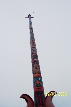
This photo certainly captures the immense height of this totem pole. But it only hints at its beauty; there just isn't much detail towards the top. I can't say for sure why. It seems a bit washed out, so the exposure may not have been correct; the difference between the pole and the sky makes this very tricky. Or it could be the jpeg artifacts; you should set your camera to the highest quality image setting. It means less photos can fit on your memory card, but they will look a lot better. Poor focus is another possibility.
Several people commented that you have too much negative space around the subject. The only comment that approved of it is my own! And I still like it; it shows off the shape and emphasizes the height. So you have conflicting opinions; choose the one that pleases you the most!
Good subject. I like the negative space and I don't really mind it being tilted. But I do wish it was clearer; the low quality compression certainly doesn't help.
The date on the photo is distracting, and I would like to see the ground - it would make me believe how tall this statue is. Otherwise I like the idea.
You will probably get many comments on the yellow text over your image. It is really oooops you should try to avoid. You could have edit it out in this challenge (it was legal). The object is interesting, but has way too much space around it for it to really stand out. I would suggest moving closer or zooming in a bit towards the top. Image could also use a bit of brightening.
Take the time stamp off please, it's taking points from your grade.
To much negative space, and the space isn't good looking, just some grey sky.
To little details, either let people see it, or forget them, don't tease the viewer.





 Add photograph to your favorites
 Add photographer to your favorites


 Photographer found comment helpful.


