Photoshop functions used: sharpen, auto contrast, desaturated yellow, blue, and green, increased saturation of red, and despeckled.
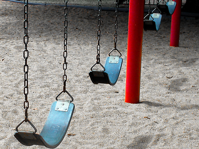
I desaturated out the red, green, and yellow to take the accent off of the background colors of the sand, edge of the playground, and grass. I wanted the swingset to stand out prominantly in a surrealistic way.
Statistics
Place: 58 out of 172 Avg (all users): 5.4226 Avg (commenters): 6.7895 Avg (participants): 5.3719 Avg (non-participants): 5.4746 Views since voting: 1033 Votes: 239 Comments: 20 Favorites: 0
Nothing better to depict childhood than swings. At least 15 other people thought so. lol. I like the pattern to these swings and how they are spaced out. The red poles kind of contrast the bluish tint of the swings. I know they are really black, but looks like the sky is reflecting in them. The angle you chose is very nice. Good luck in the challenge.
Nice shot, nice isolation of just a few elements. Would like the red uprights to be more vertical and there seems to be a lot of dark shadow at the top/ back of the shot. 6, Kavey
Best of the swing shots. Nice angle and the colors complement each other. The angle of the poles somewhat distracting but if straitened, the chains on the left would be off. I don't know which would be better.. otherwise I like the framing.
I like the simple colors and composition. I assume you wanted to include the entire swing at the top, but if it could have been cropped so that the blue "divider" thing wasn't showing, I think it would have been better. karmat
Good composition and lighting, and I love the red poles, I think they are critical to this photo. I find the "stuff" at the very top edge to be just a little distracting. lhall






 Add photograph to your favorites
 Add photographer to your favorites


