Positives:
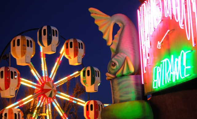
Colorful composition that conveys a sense of a fair. Technicals are good.
Technicals:
Colors are vibrant, the very deep blue sky background is very nice. Well composed image. It does not have any distracting digital artifacts but might be very slightly soft focused, but that might just be me because I like ultrasharpened images. The angle on the sign is a little to 'edge on' making it unreadable and on the busy side. Almost looks overexposed on the white neon. It may not be but the image is bright in that area.
The Challenge:
Meets the challenge but that is never enough at DPC. An image needs something special to set it apart from the rest.
It scored about .2 below the DPC average. I gave it a 7 but that is the score I give an average DPC image. So basically, both the voters and I agree, we just express it a little differently.
Suggestions:
Try a slightly different angle further to the right of the sign so voters can better distinguish the neon lettering detail. Might not make it look so bright either.
A fair needs people and/or fairway action to provide a full effect and the lack of either in the composition might have subconciously contributed to giving it an average score. Something you could try is a taking long timed exposure when the background wheel is in motion to show a lot of rotation.
I like the colors and composition. The subject matter really stands out among all the city skylines. But it looks kinda static. I'm thinking it would be a more interesting picture if you could give the feel of the fair, maybe with some people moving around, or the ride in motion, or something like that.





 Add photograph to your favorites
 Add photographer to your favorites

 Photographer found comment helpful.


