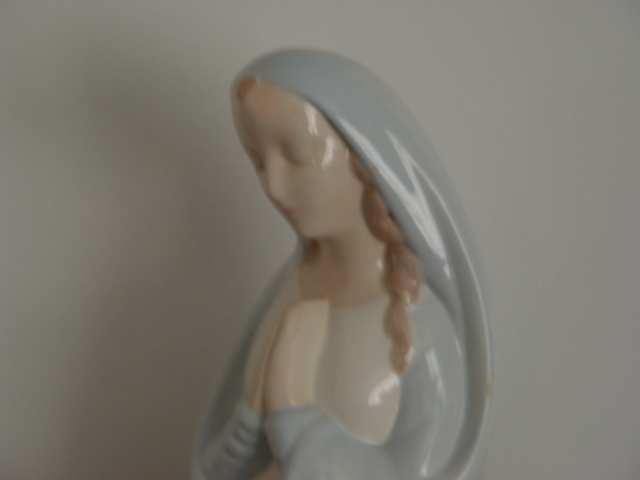
This photo was meant to be slightly blurry, focused, colors meant that way, as well as shadow...was supposed to imply simplicity in all aspects. I wished it would have done better...but oh well..maybe next time. If it were more detailed...then it would not be SIMPLE.
Its a little out of focus. If only it could be sharper and the contrast of the image could be increased. In my opinion this will help to enhance the colours and depth.
The photo is a bit blurry, and I think lighting is not enough as the whole photo gets a greyish tone. I wouldn't have centered Her, I would have composed her more to the right, She could have enough negative space in front of Her for Her thoughts and prayers. A bit fining on the lighting could have made you avoid gleams on the statue. The idea is nice, and pastell tones are good for the photo's simplicity, too.
I'm afraid the quality here is... well... just bad. The image is only 6K, when you can submit up to 150K. Saving it at that poor a quality definitely has a big impact on the shot, I'm afraid...






 Add photograph to your favorites
 Add photographer to your favorites


 Photographer found comment helpful.


