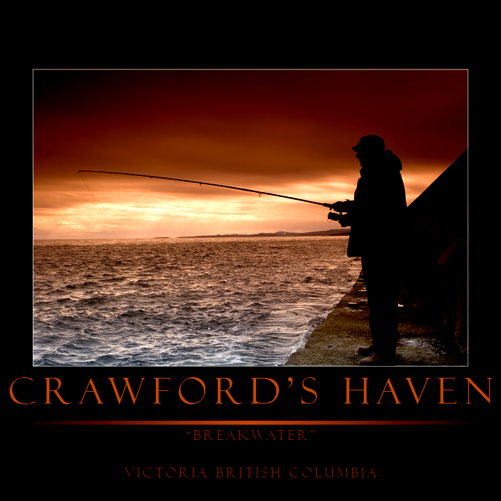
tip tipt tip for ya - (my opinion of course) - the image is beautiful. I'll comment on it in the other version. For the poster or print here - the title should not exceed the edges of the image itself and the words below the line should be more evenly distributed / spaced vertically - that would make it look MUCH more polished and professional, IMO. Look at those motivational posters or travel posters as an example of the kind of guidelines they follow regarding the borders, titles, subtitles, etc.
edit: Oh, and shave off some of that top border - it should be the same width as the left and right.
Message edited by author 2007-04-08 02:41:43. |




 Add photograph to your favorites
 Add photographer to your favorites


 Photographer found comment helpful.
