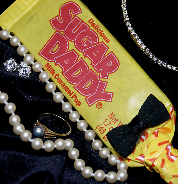
The white specks inside the necklace are distracting. Took a little bit to figure out the dark on the "Sugar Daddy" is supposed to be a bow tie. Pearls on the bottom need to be better focused. Nice idea though.
The idea is nice and funny. I love the way you photograph the jewellery. It needs skils to take such a photo. The caramel bar spoils the effect though. Has a cheap look to it and just doesn't give a good impression next to the fancy pearls. I gave you a 6.
This could be an ad for the candy or bow tie, I don't know how a jeweler would feel. I like it because it's playful. I am a bit thrown off though because it is...such a clash of content. Still fun picture.
Technical: Fits the challenge very well! Exposure composition focus lighting all excellent- I think I would have used a less shiny background though, so as not to detract from the subject!
Personal: Really nice to see some creativity. The Sugar Daddy strengthens the idea and adds some humor. I like it!
funny, original. Nice touch with the bow tie! Upper right corner works better than lower left because there is less glare off the background material. composition feels a bit cramped.
Excellent take on the challenge and I like the composition very much, especially the bowtie on the candy...Very well placed! Only things I can see critiquing are the lighting being too harsh and I don't like that the two areas of the black background came out different looking. The lower left shows much more sparkles than the upper right. I enjoyed viewing this photo very much...well done, and good luck in the challenge...I'm rooting for you.





 Add photograph to your favorites
 Add photographer to your favorites


 Photographer found comment helpful.


