I would like to thank all that voted and just add I have taken all comments on board.I will endeavour not to rush my next entry and hope to improve the quality of my next entry.From the comments received this could have had much higher scores if the shot had been more carefully thought out.
Thanks,
Paul.
This might work but the background is distracting. Perhaps move him completely in front of the wall or something? Good choice for the challenge though.
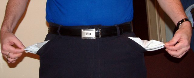
Great idea, fitting the challenge much better then many other submissions, if not even best: the link too money is perfect. However, the image is a little too "snap-shooty" IMO. The background disturbs and due to the flash the light is too harsh.
Good idea. Execution could be improved : for example by paying more attention to the background, light area on the left, dark area on the right, with painting or door ? Should be equal and not drawing attention away.
A good idea for the challenge. Perhaps one pocket would do as well as two? Or better for not splitting our attention. The balance of having both packets is ruined by the distracting and imbalanced background. The lighting is casting some harsh shadows that take away too.
The lighting is kind of harsh. If you have no other light source than on camera flash, try practicing with available light. If your camera allows it, try to balance flash with existing light.
Technical: Fits the challenge. Exposure/lighting- you used a flash, didn't you? Yuck.... Composition looks too cropped- this could have been done without making it that narrow. Focus is good.
Personal: Good idea, definitely could have been more creatively executed.
Really good idea for the challenge. I think your composition needed a bit more thought. The shot is well focused and the colors are good. The light is a little bit harsh, but not too bad. Good idea.
You should have him stand in front of the wall without the door or something in the back right side. Also, you need to think about getting rid of the shadows of the man's hand and pocket with another light source.
It's a good concept for the challenge - great idea. I think it could be improved if you had the model standing in front of a blank white or black background or something similar - the few elements on the right side of the frame are a little distracting.
This could be a good idea, but you have to think about the background when you take a picture and the flash is giving some ugly shadows, anyway good idea ;)





 Add photograph to your favorites
 Add photographer to your favorites


 Photographer found comment helpful.


