Greetings from the Critique Club.
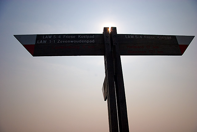
During voting, I gave this image a 2. It definitely does meet the challenge, but I found the choice of subject matter unoriginal. My argument was that if you're going to do something as obvious as a silhouette for Contre jour, it really better be an interesting one.
The good thing about the composition is that it's simple, and the fact that it's slightly off-centre makes the image less static and more symbolic of a journey. The sky is niceish enough, but unexciting. Maybe more post-processing would have brought out the colours more. The white halo around the sign is indicative of oversharpening, but it might just be the light in this case.
There's nothing obviously wrong about the image, but there's just nothing that moves me about it. Maybe a different POV would have helped. Maybe leaving more negative space on one side would have been more indicative of a journey. Maybe giving a more thought-provoking title would have made it more interesting. Or maybe you should have just gone for a different picture.
Jelena |








 Add photograph to your favorites
 Add photographer to your favorites
