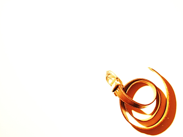
Personally I had a very nice childhood. But since the challenge was not explicitly about our own childhood and I didn't feel like photographing toys, playgrounds or something like that, I took this approach. Family violence is still an issue. I hope not for you.
Statistics
Place: 85 out of 172 Avg (all users): 5.1048 Avg (commenters): 6.5957 Avg (participants): 5.4715 Avg (non-participants): 4.7440 Views since voting: 1385 Votes: 248 Comments: 54 Favorites: 0
Ein verdammt gutes Bild! Hey Stephan - vielleicht erzähl ich dir irgendwann da mal eine geschichte zu! Nur soweit, ich find das bild nicht nur technisch sehr gut, sondern inhaltlich mehr als nur gut - atemberaubend ist vielleicht ein gutes wort für! Ich find deine bilder und die gedanken, die du dir zu machst ziemlich gut!!! Martina.
I think we were shocked to see a strong image like this were we thought we will only find nice kiddie images. That said, I think this is a very strong photo that diserve much more. And the ¨"snake" form, intentional or not, it's there.
Regarding the title: I recently saw a film where a boy had to say "Sir" to his father and I found that really weird. I didn't chose it to explain the photo. I think the photo is understandable without it (when you know the challenge). In retrospective I agree that the photo has a flaw and many commented on that. Despite I wanted it to be simplistic and only portray the belt as a symbol, I agree that the emotion it suggests is not conveyed. It's too bright and the yellow/orange colour is too nice. It's not that I now dislike the photo. It's again almost exactly how I had it in mind and how I wanted to make it. I wanted to experiment with negative space and I liked the colour. But I should have put more effort into trying to convey the theme than experimenting with the techinque ;-)
To GeneralE: I didn't intentionally put the belt like a snake. I'm an atheist and to me a snake is not a symbol of evil. But your idea with the hand is good.
wow, very artsy take on childhood! i really like this. of course, my sister and i had to pick out our own switches!! i like the framing and overblown lighting. nice work. 9--amitchell
Ouch! This photo makes me cringe a bit in connection with childhood. It is a beautiful and well compositioned photo though. I hope the childhood reflected here was not yours.
Sad but true that is part of some childhoods. I'm not sure why you chose to do the negative space on this one, as I don't think it really adds anything. Certainly the stark white background runs counter to the darker emotions you are trying to convey here.
subject matter aside, this is a great shot. i love the negative space and the curves and shadows of the belt. the only thing i might change is to crop it so that the belt is a little bit further from the bottom edge. it looks a little close and too crammed into the corner. in fact, the whole belt might look better moved up and in more so that it more closely lied on the thirds. nicely done, overall.
I like the idea behind this photo. I like the coil of the belt - it's shape. The lighting although very bright on the belt even worked for me because it caused me to squint and withdraw a bit the way I might if I knew my parent was coming with the belt. My biggest concern with this photo was the belt's placement. I found it appealing and interesting - composed quite like an ad might be; but ulimately I thought it was just too much photo for such a small focal point. TOO much negative space. 7, just-married
I had initially scored this as seven, but after thinking about this particular shot for a couple of days, (it stuck in my mind; not much does that), I am raising it to a ten. Teh stark colors, high contrast, and vast negative space really make an impression, I think. There is nothing I can think of to tell you to do to improve. I think it is a very well executed and powerful photograph. karmat
It's stark, it's a slap in the face compared with most of the images I have seen. But, there is no denying that childhood can sometimes be bad. This shot didn't need a title, as far as messages are concerned it's strong enough… The use of heavy overexposure and a vast white area works, and whilst I may not like the message, the picture has been well thought out and well executed. In effect, you have hit the challenge full on – no pun intended – with an excellent display of artistic and photographic competence. (10)
All the negative space and the high contrast work well to accentuate what a powerful symbol this belt is, and how much fear we can still associate with it as adults. This is a powerful photo. 10 - lisae
I don't really relate to this photo but it does contain a powerful feeling and it is a well done photo except for the overall brightness and what seems lke too much white space at the top left. =6 syamjonimi ;'-D
I think there may be a tad too much white space here, and the lighting is almost too bright - especially on the buckle. These are the sort of memories I try to block out, but it fits just the same. Nice job posting a controversial shot.
Strong, unpleasant memory. Another photo used this same concept with a "father figure", it seems to me that is would be a helpful element. I think if I were to suggest the best set up of this concept, it would be something like this: A broken jar in the foreground, with adult male legs and a belt hangning down beside him. This would tell a more complete story than just the belt, you know cause and effect sort of thing. As for the photo itself, it is very stark (bare) and the belt buckle doesn't come across very clearly. 6 Swash
Not only the belt, but the reference to a snake, makes this image, for chidhood, a severe one, but it is technically very good, and artistically very aesthetic.
love the high key shot. a little overblown for my taste, although it looks purposeful. love the neg space. something seems a litlte static in this shot, though...
simple and to the point. I love the concept behind this photo, but in my opinion it is too bright. the buckle is almost washed away. I love the placement in the frame and how the background is non existant, however, I have the feeling the background is the reason for the photo being brightened so much. Overall good photo and good luck in the challenge.
I like this picture. I had a similar idea, but my wife thought it was too dark for such a happy challenge. Anyway, nice lighting and framing of the picture.
I think this would be strong if the belt were an obvious man's belt. Maybe a bigger buckle ... and then, if it were coiled in a manner more consistent with hitting.
First off, this is an excellent picture. I love the exposure, the framing and composition. However, conveying the theme was carried more by the title than the picture. Another entrant submitted "Daddy!," showing a silhouette of a man holding a belt. To me, that conveyed the idea without needing to read the title.
My brothers could relate to this only my dad was a barber and the strap was more lethal...I think your composition could be improved by strecting the belt out more.
I almost had to laugh when I saw this shot. It definitely speaks of childhood to ME ! But... only because I know what the challenge is. On it's own, this photo would not convey that message to me. I do think that your perspective, and idea, are unique and creative.
kind of scary, but i assume this is a symbol from people's childhoods (thankfully not mine). Interesting use of white space.. I think the belt is a bit too bright tho.. maybe if it had a bit more contrast or darkness to it? 8





 Add photograph to your favorites
 Add photographer to your favorites

 Photographer found comment helpful.


