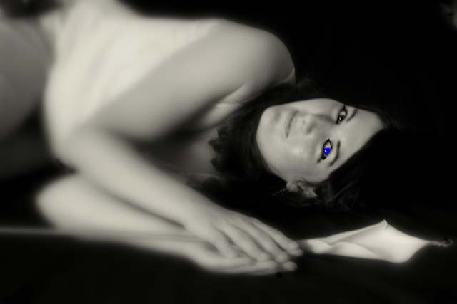
Editing=Picasa2(B&w, sharpen, soft focus)Paint(added blue to left eye and enhance black around eyes)Adobe Photoshop 6.0(my first time with the burn tool to try to remove the hot spots on the model's face and to enhance the black r eye and the eyebrows and the black around the model's eyes. Resized to 640x427)
Statistics
Place: 563 out of 573 Avg (all users): 4.3198 Avg (commenters): 4.7500 Avg (participants): 4.1545 Avg (non-participants): 4.7347 Views since voting: 830 Views during voting: 282 Votes: 172 Comments: 7 Favorites: 0
I didn’t vote in the Free Study so this is the first time I’ve looked at your image. My first impression is that the one blue eye looks really out of place. That part you realized shortly after you started receiving comments. Ok then, if the eye wasn’t blue what could you do with this image to give a different look. I think the shallow depth of focus works well in this image but the bend at the models waste draws the viewer’s attention away from the in focus eyes. If you cropped the left side of the image just past her waist, I think the focus would look more balanced. You should note that this crop will cause her elbows to be cropped just a bit also but I think it would still work. It will also crop off part of the flower stem but this will improve the image as the left end is sort of bright and the crop will make the stem blend into the background more. Now with the left side cropped you will need to crop some off the right side to bring the models eyes back to the rule of thirds position. This will take the very tip of the flower off but if it doesn’t cut into the body of the flower no one will really notice that it is gone. Give it a try and see how you like it. I always try to find a couple of ways to crop my images to see which has the biggest impact. If I don’t like the crop, I just undo the step.
Feel free to PM me if you have any questions regarding this critique.
That blue eye is truely perplexing. Normally you can understand why someone did something, but I just don't get it. You say it was to accent the black around the eyes, but why one eye?
I like the pose and the blur, but the colour of the blue eye makes it look tacky...sorry :-( Maybe something more subtle on both eyes? maybe not do the blue thing at all...???
I don't like it. The blue eye is too much saturated. The blur is a bit too much making it look like her face isn't connected to anything although I know it is. Nice line up across the bottom through the hands and the flower. My mind tells me her body should be in focus with her face unless she has a really long neck? lol.
The focus on the face is good and the viewer is drawn directly to it, however, one eye has a much stronger blue tone to it than the other and it's very distracting.





 Add photograph to your favorites
 Add photographer to your favorites

 Photographer found comment helpful.


