Author Thread
Post actions
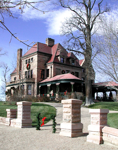
Very Nice Picture of the Rosemount!! Which day you taken the picture.
Post actions
Greetings from the critique club,
Comments Made During the Challenge
Post actions
Beautiful! I would crop a little more at the bottom and show more of the sky and will lower the house a little bit for a better rule of thirds. 7
Post actions
Georgeous photo. What are the two green things and one red thing between the columns? Just curious.
Post actions
A bit of amputation on the right distracts
Post actions
Nice shot, love the colors...
Post actions
Nicely done. This photo looks surreal.
Post actions
It seems as though you cropped it too tight on the right side.
Post actions
I love the title and the composition with the tree and the wall abutments. Thats really a fantastic angle to take a picture of a house. However- it occurs to me that scattered around chinese restaurants and laundromats are books and books full of house pictures. This one might say "large 15 room stone victorian mansion- 1.5 million."
Post actions
Lighting a bit harsh but great idea and nice subject. - 8
Post actions
The branch on the left is just 'in the way' -- like the contrast of the sharp green of the grass and strong blue of the sky. Just that pesky branch =)
Post actions
Good colors, I like the detail.
Post actions
Nice image but the columns at the entrance of the walkway are overexposed. I get tricked like by stone all the time. Who would think that such a material could be so relective. Maybe this could have been slightly corrected with a polarzing fiter. It would have helped the sky too. Nice composition
Post actions
Nice colors and focus and DOF. Great composition. Not much for staying power though. I also thing that it's kind of a stretch fitting the competition with the title...
Post actions
Post actions
Beautiful home, wish I lived there!
Post actions
The contrast seems a bit heavy on the house, with dark areas too black against the rest.
Post actions
Beautiful photo. Little over exposed maybe on the wall, but otherwise perfect.






 Add photograph to your favorites
 Add photographer to your favorites

 Photographer found comment helpful.


