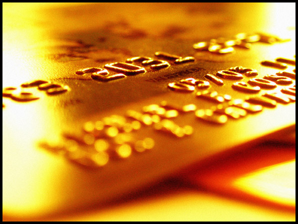
Natural windowlight, shot at +.7 stops overexposed. Color levels for red and yellow bumped up in Photoshop to really make the gold hues come out and try to give the shot a "money" feel.
Statistics
Place: 14 out of 153 Avg (all users): 6.0403 Avg (commenters): 6.9286 Avg (participants): 5.8085 Avg (non-participants): 6.1818 Views since voting: 1316 Votes: 248 Comments: 17 Favorites: 1 (view)
Now that is an interesting angle. I like the gold color too, works well in a money challenge. With the bottom right corner didn't have those lines - papers? Just a shadow would be less distracting. Nice DOF use. 8
My 2 cents - I think this is good DOF used in the wrong way. The picture focuses the viewer's attention on the numbers 2031 but there's little/no significance in it alone. Although we all know that this is a credit card, the DOF seems to be trying to tell a different story which doesn't mesh well.







 Add photograph to your favorites
 Add photographer to your favorites


 Photographer found comment helpful.


