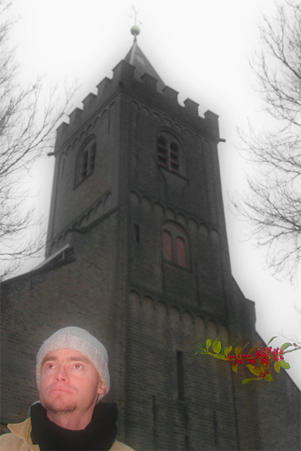
Today I went out with my best friend to take some photos. We tried a few in front of various churches. This one was the best as there is quite a contrast between my friend and the church. The branch looks like a cut and paste job in PS but it is only of my use of the flash that is so noticeable (I didn’t really saw it until I had made this picture).
While some might say it is distracting at the same you can imagine a little story. Something like: the branch looks as if someone is holding it to try getting the attention from the saintly person in front of the church and lure him to damnation :D. The branch says: “The church is boring; it is old fashioned. Join me for a fantastic and colourful time :)”.
Anyway I used my EF 28-105 F/3.5-4.5 II usm as lens.
Statistics
Place: 59 out of 99 Avg (all users): 5.0000 Avg (commenters): 6.0000 Avg (participants): 4.9412 Avg (non-participants): 5.0526 Views since voting: 1231 Votes: 144 Comments: 8 Favorites: 0
This composition doesn't really work for me. The different elements don't really seem to fit together. Whatever story it is trying to tell (since there does seem to be one) just isn't getting through very well at all. Also, I don't think there was any reason for soft focus in this shot, as it doesn't seem to fit.
I can handle the person in the shot (though I like the building better by itself), but the branch on the right is way distracting. It looks unreal. Did you use an on board flash? Also the church is a touch tilted in frame. Otherwise a very nice shot!
TC
I'm not sure I understand the relation between the 3 elements here, but it must be something I'm not privy to, so, no penalty for my lack of understanding. Regardless of their relationship, I think the placement of them in the frame is awkward and distracting. The angle for the portrait is not very flattering either, we're kind of looking up his nose.






 Add photograph to your favorites
 Add photographer to your favorites


 Photographer found comment helpful.


