This was not exactly what I wanted to do for this challenge. I wanted to do a portrait, but I was focusing more on my new website and ran out of time.
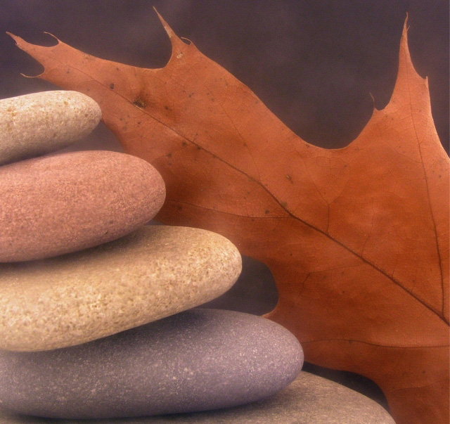
Used a piece of plexi, scratched slightly with a wire brush, to create the softness required for this challenge. Also tried butter...no good, to mottled.
Statistics
Place: 16 out of 99 Avg (all users): 6.2168 Avg (commenters): 7.5000 Avg (participants): 6.1061 Avg (non-participants): 6.3117 Views since voting: 1320 Votes: 143 Comments: 14 Favorites: 0
The mix of the hard pebbles and the fragile leaf is interesting. It's fairly soft, which is good, and the colors in the pebbles are good. It seems just a tad overexposed, but the textures are good.
That's a pretty good diagonal composition, with contrasts in color, texture, and shape. I think I'd put a 2-10 pixel black border on it though, I think it would tie it together better than the default gray on the DPC page.
When I first saw it I thought it might be in water -- you might want to try it again in a tray, with the stones covered by a 1/4 inch or so of water.
This picture would have been too striking in sharp focus -- so the soft focus use here is GREAT!! I love the contrasting colors more than anything! But there's something that can't be beat about soft focus and leaves...
interesting composition and good work with the soft focus.... the rocks, in some strange way, don't feel comfortable with soft focus.. maybe a bit of a contradictory theme...
this should've been the example for those of us who had trouble understanding the concept of soft focus. I am partial to borders and think it may have looked better with one but that is no reason to deduct any points from perfect. 10






 Add photograph to your favorites
 Add photographer to your favorites


 Photographer found comment helpful.


