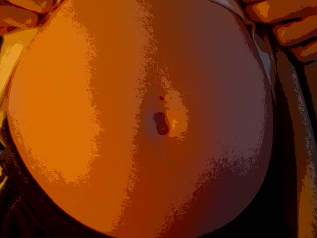
This is an excellent shot but I really think the post-processing ruins it. With good lighting a minimal amount of processing would be required here. Also I noticed your file is only about 23K. Your image will be truer to the original if you reduce the compression (increase the quality) on the JPEG.
I like the posterised look of this photo. This is very close to not meeting the challenge requirements, because the entire photo is filled up with a child... he/she just hasn't come out into the world yet :). I think it's a very nice idea, and I hope the delivery goes OK!
I can imagine many will lament about the colouring and the postprocessing effect but I like it. If it's better or worse with the effect than without I can't say. I would like to see the original. Maybe it's a mans belly (a man who drunk lots of beer) and you make fun of us ;-) In my opinion it is also creative because as far as I can see it's the only photo depicting our prenatal childhood. -stephan
I really think this would have been a superb picture without filters or effects of any kind. The idea is bold and original, but the colour makes it look a bit like an orange. I am really sorry if that sounds harsh, but I really think you had a winning idea and shouldn't have added anything…
This is such a simple and good idea. The colors bother me at first, but then it sorta grows on me (no pun intended!). My first inkling is to say this is not a photo anymore. Then, I think - why not? The perspective is good, as are the position of the hands.
I wonder if you were going for the fetus's childhood or the "What's in Mommy's belly?" aspect. I kind of like this photo in that whatever you did makes it not LOOK like a photograph. Curious for a how to. I like the orange lighting, although I expect many will not. 5, just-married
At first, I thouhgt that this was either poorly taken, poorly edited, or lost a lot during the upload. I now notice that this effect was done on purpose due to the fact that the original file name is "psyshodelic belly". I will admit that I don't like it very much, due to color distortion, darkness and angle. However, I would loved to have seen this at a side angle, with either full color or black and white. from a bit farther back, and the hands kind of cradling the belly rather than holding up the shirt. I think this was a really great idea, but in my opinion, not well presented. Also, if this is how you planned on it looking, and you are happy with it, then just tell me to shut up, ignore this and try again for the next challenge. Take the photos YOU like, and don't worry about anyone but your self. Good luck in the challenge.
For me this is more about upcoming childhood than actual childhood - though perhaps if one has younger siblings there is the memory of mum's belly, and touching it and waiting for the addition to the family to arrive? Is the high contrast and low depth of colour intentional? Kavey
we've all "been there". I just love this picture! It looks like a painting. What a wonderful idea and a great mood portrayed by the color, the lighting, the close up view.






 Add photograph to your favorites
 Add photographer to your favorites


