Man. That is sad. I didn't vote or comment on this challenge.
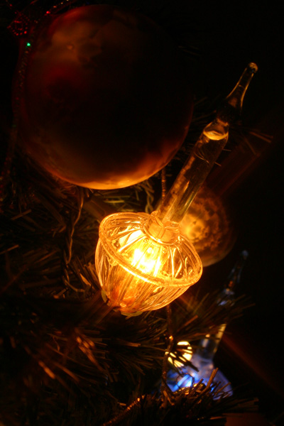
If I had, I would have said it was a bit too dark and the highlight on the bulb is blown out.The ornament in the upper left takes up too much of the area and takes away from the composition. The two lights are attractive and the composition might have been more pleasing if you had composed them more within the frame and also tilted the camera to get them to look slightly more upright.I do like the mood but it doesn't look soft focused. With a little more work, I think this could be a wonderful christmas card. but that's only my opinion.
Edit: congrats on the new camera, and happy shooting.
Message edited by author 2003-12-08 08:59:45. |




 Add photograph to your favorites
 Add photographer to your favorites


