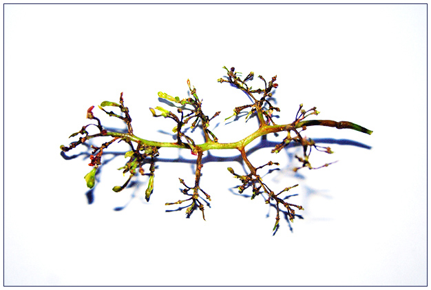
Compositionally, I find this to be very static. It is 'flat' horizontally, and it is centered. While this can be effective in some situations, I think in this one, it is just "there" and doesn't add interest, context, or anything to compel the viewer to keep looking at it. I think perhaps turning it on a diagonal so that it "starts" in one corner and leads to the other would help a little bit. Also, if it filled up more of the frame, it might be a bit more interesting.
Technically, it is a very crisp image. The white background is very clean and clear of distractions. The colors are okay and the focus seems okay as well. To me, it seems to have the "edginess" that says "overprocessed" for whatever reason.
I applaud your willingness to approach the challenge from a different perspective. Eating healthy is definitely part of it.
If I need to further clarify or explain anything, please let me know.
karmat
I think most people consider fitness to mainly include physical activity, but I guess eating healthy keeps one fit as well. I like the simplicity and clarity of it, but there's something about it that makes it look over-edited. A little too yellow on the stems and a little too indigo on the shadows. I guess maybe that isn't your fault. It's quite nice.






 Add photograph to your favorites
 Add photographer to your favorites

 Photographer found comment helpful.


