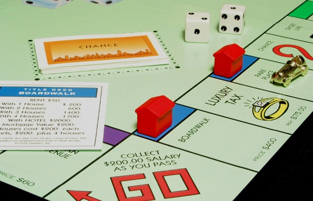
I always dispised this game, it's fun for the first hour maybe, but then you just keep on going around and around and... good use for the money challenge. The shot is very clear and I like that you don't have any other action going on in the corners.
I like the tightness of the composition. Just enough elements to get the message across. Wish the "GO" were lined up with the edge better, would feel better and have more impact.
The photo would have been more powerful if the dice were showing "2" instead of "3"--then we know the player would have to pay $2000. As it stands now the car is going to shoot right past boardwalk!
I like the idea. I would try a different light source (maybe stronger?) The lighting on the board seems a little off, but that should be fixable with a different white balance (looking at the boardwalk title card, the white seems to have a bit of a green/yellow tint). I'm not sure about the cropping either, it is a little too tight imho.
-5-





 Add photograph to your favorites
 Add photographer to your favorites


 Photographer found comment helpful.


