[...] well here is a decently post-processed version [...]
Lost the feeling I liked in the original one. The linked one is "Nice technically but no real wow factor." (I must have said that seeing Robert's different comment.) Try something between the two in post-processing and also try to improve lighting at setup phase. I suggest leaving the softbox above for main light source and using a reflector sheet below and to the right of the camera to lighten the deep shadows.
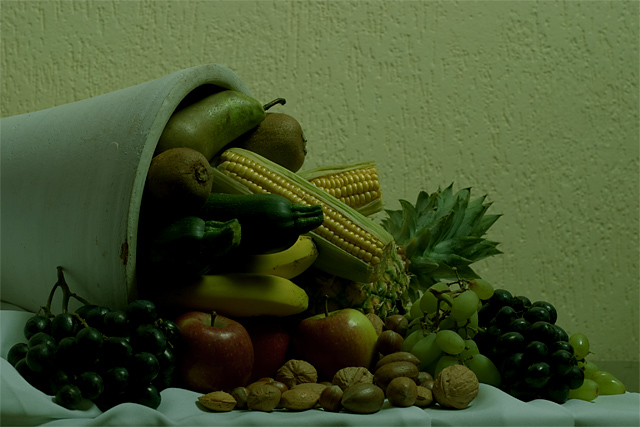
Post Challenge: 23 commenters were very clear about it: I messed up in post processing. I agree. The picture was off colour and dark on purpose, to mimick an old painting, but the result was not pretty, I admit.
Some people liked the composition though, well here is a decently post-processed version.
What can I say? Lowest score so far, highest number of comments as well. Thanks for taking the trouble of explaining my mistake to me, I learned from it.
You've gathered a cornucopia of fruits and vegetables, and then we can't see them! Yellow corn, red apples, green grapes, etc -- this should be a colorful photo. As a minor quibble, I wouldn't use broken corn like the chopped off piece at center unless I was making a statement about it, it's very strange visually.
Too dark/dingy and if it could have been moved out from the wall and the wall off it would have been more interesting. I keep finding my eye going to the texture of the wall (or the far left of the cornucopia).
A bit underexposed which made the highlights work well but _still_ (sry) you should have lighten up the shadows even with postprocessing. I really like that you presented a classic still life. Thank you.
looks like this was shot under flourescent lighting.. Too much green.. You can use a magenta film over your lense to correct that... UNLESS, IT WAS INTENTIONAL !! Still too green for me..






 Add photograph to your favorites
 Add photographer to your favorites

 Photographer found comment helpful.


