Having enjoyed voting for a while I decided I'd try and submit, if only to see things from the other side ;)
This is the first time I've used our Jenoptik digital camera, and I think, possibly, also the last! ;) It's fully automatic, which I hate, so I can't play with any settings at all, and the light meter is truly awful.
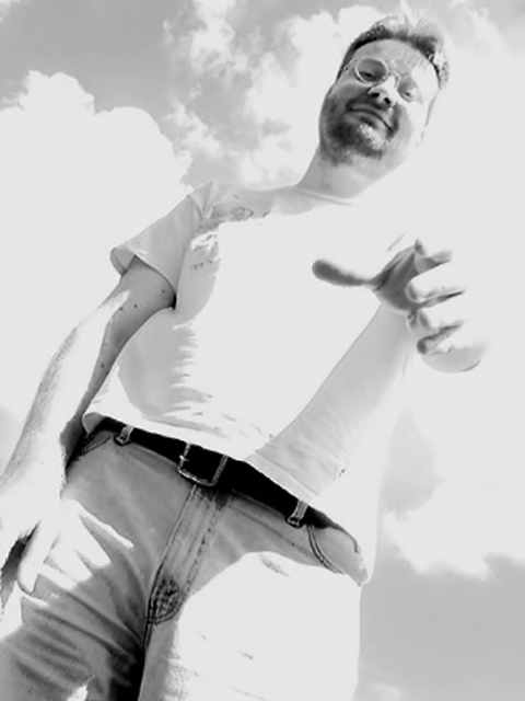
I used neatimage to sharpen and despeckle. Because the colours were so weird, I decided to desaturate. I actually like it in B/W better anyway. The white-out/ glare is not deliberate but I find it quite interesting because the T-shirt and other parts of the image bleed into the clouds.
I have distinct childhood memories of clinging to my mum or dad's legs when I was pretty small. I can even picture their trousers. So I wanted to convey a child's lowdown perspective and also the idea of a guiding/ helping hand, being offered to the child, stretching down.
Statistics
Place: 123 out of 172 Avg (all users): 4.7450 Avg (commenters): 6.2143 Avg (participants): 4.9453 Avg (non-participants): 4.5366 Views since voting: 1839 Votes: 251 Comments: 31 Favorites: 0
Framing/composition are nicely done. I like the range of shades, although the harsh conditions seem to have led to overexposure. Depending on the editing applied it pay have been worth playing with contrast/brightness to reduce blown out areas.
I like the composition and framing of this. I also like the bw. The only thing, in my opinion, that is weak about the pic, is that it is a little too bright on his hand. For some reason, this looks more like he is trying to grab you rather than help you. Maybe if it was palm up it would look less "threatening" to me. karmat
This is an excellent interpretation of the challenge.... I love the choice of framing, it suggests the view of a kid trying to clumb up on something or who stumbled. the only technical issue I have is that some of the whites appear blown out and the man's shoulder blends into the clouds. If your camera supports this a shorter exposure time or narrower aperture would have corrected this, otherwise a levels adjustment in your image editing software.
This is really cool. I like the overexposed look, because it's just like being dazzled by looking up towards the sun. It helps the sense of scale and perspective. The man's face is kind and friendly. Very evocative. (There's maybe a nasty undertone if you imagine he's a big bad stranger rather than a kindly father or relative, but I'm mostly ignoring that!)
'n fawr arfer chan an i fyny bysgota , 'n sylweddol adds at 'r chyfansoddiad , a 'r ar - dadleniad chynorthwyon anrhega a yn clywed chan yn cael jyst creiniedig. 7
Great use of an upwards angle, really adds to the composition, and the over-exposure helps give that feeling of having just fallen down. 7 - Manic -
Great angle and sense of scale - B&W works well. Although intentional, I think it would have better had it not been overexposed. The scale and B&W elements would have carried this picture own it's own. Other than that I think the idea is great and composition works…
I'm glad you checked your fly before taking this shot. :) I like it because it's from a childs point of view. I think it might have more visual impact though if it were in color. As far as I know, kids don't see in black and white. The lighting is a bit harsh up towards your left shoulder it kind of gets washed away in the sky. Overall great photo. Good luck in the challenge.
I can't put my finger on what it is about this one I don't like. It does convey childhood to me but something isn't quite right. Maybe the contrast...not sure.
Nice composition, the lighting though is not what i would've chosen.. if you want to face the light like this and i think you're trying to portray a nce and 'safe' feeling, i would probably use a diffuser filter or perhaps a warming filter and cut down on th elighting a bit.
I like the concept. I definitely remember my dad's hand as an early childhood memory. Mostly for me, it's his legs and hand extended, from behind, waiting for me to catch up and holding his hand out so I'd know it. It seems you wanted the sky detail; the pose seems more menacing to me than helpful. But then, perhaps that's why kids get scared and shrink into mommy's shoulder when someone else reaches out for them.
This photo seems way too light. Perhaps it had to be that way not to get harsh shadows in what looks to be close-to-noon sunlight. Still, you lose the shape in the sky. 5, just-married
Hey Kavey! This is a good concept and you've wrestled a great shot from that dodgy camera. Certainly it's over exposed but that doesn't distract too much (perhaps because it's in B&W). The focus is a little out on his face but that's my only other criticism. I like the angle and the framing. Nice one. :)
i've got a pal who volunteered to teach photography to little kids. he said the neatest thing was their perspective - photos taken from 2 or 3 feet off the ground. nice job catching that.
As an adult, this perspective is certainly different isn't it ? I like the b&w treatment. I don't know that this photo would "stand alone" in conveying the "childhood" message, but within the context of the challenge, I like the photo. lhall
Cool image. Well done. Love the angle of the figure; and how it rises high above the small child. Love the blurred hand. Image seems a little washed out though in places; wonder whether you could improve that in Photoshop. Prelim: 7 Journey Update: I do not like sentimental and cute pictures and in this challenge have had more than my fill of those. This picture, however, is so very "sympathetic" (can't find a better word for it). Of all the pictures, this one symbolizes childhood most or what it OUGHT to be.: smiling, protective, secure.... I really love the blurred hand but am a little bothered by how large areas are washed out (duotoning in Photoshop could enhance this image a lot). Hence I can't give more than an 8 for a final score. Journey





 Add photograph to your favorites
 Add photographer to your favorites

 Photographer found comment helpful.


