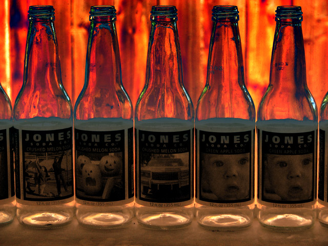
Isaac's bottle collection -- unfortunately none with my photo on the label.
- Handheld
- Cloned-out stray branch on left edge and a few stray dirt spots on windows
- Horizontal gradient masks created
- RGB Curve for upper portion
- RGB for lower portion
- Red and Blue Curves for lower portions
- Resize for DPC
- USM at 16%/64 dia/TH = 0
- USM at 16%/64 dia/TH = 0 (second application)
- SaveAs JPEG at quality 7/10 = 123kb
Statistics
Place: 65 out of 102 Avg (all users): 5.3799 Avg (commenters): 5.6000 Avg (participants): 5.1600 Avg (non-participants): 5.4651 Views since voting: 1161 Views during voting: 300 Votes: 179 Comments: 7 Favorites: 0
Positives:
Color and composition very good. Attention to detail is the strength of this image. You made it absolutely balanced top to bottom and side to side. That is something this viewer notices.
Technicals:
Technicals are strong. Sharpness excellent, brightly colored backlighting is very nice. Perhaps the weak lighting on the bottle labels hurt this in voting. Camera settings are A-OK.
The challenge:
Pop Culture is such a subjective concept that probably most images were viewed by some as dnmc. Hard to know if that is true in this case but likely given the precise viewpoints some voters assume. I generally vote the image and not the challenge so don't worry much about it.
Suggestions:
Only one suggestion - Either add some front lighting directed at the labels and/or brighten them in post processing.
For an experiment you might consider adding a 50% greyscale layer and painting with a 'vivid light' white and/or brown brush of about 8-10% opacity over the labels to make them stand out more. That might have a dramatic impact of the overall viewr interst in the composition. The labels are just a little to dark as they are.
Wish the 2 bottles on the right were different. I like the effect behind the glass with the colors showing through in the back but the image seems really washed out, esp on the labels.
Good idea for this challenge. I might have liked just a wee bit more light to show the labels, but I love the orange glow behind and the way it makes the bottom of the bottles look.






 Add photograph to your favorites
 Add photographer to your favorites

 Photographer found comment helpful.


