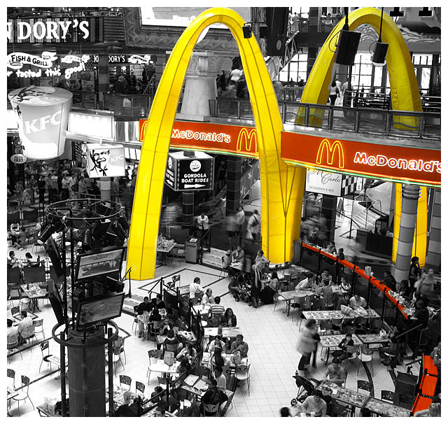
Taken at Canal Walk shopping centre in Cape Town. I did toy with the idea of just having the arch in colour but then decided on both the sign and arch. See thumb below.
PP:
Developed from RAW
Cropped
Duplicated photo into 2 layers
Desaturated the top layer using Channel Mixer to get contrast right
Added a layer mask and altered it to let the colour through
Resized for web
USM
Saved for web
Post challenge: WOW. This is a personal best and my first top 10, so I am excited as I never thought I would make this. Thanks all for the insightful comments - luckily many people got my intention behind this... And it wasn't to glorify McDonalds! It was rather to show the over-arching influence it has globally, and all the masses of McEaters scurrying about underneath.
Alternative edit:
Statistics
Place: 5 out of 102 Avg (all users): 6.9372 Avg (commenters): 8.1538 Avg (participants): 6.5882 Avg (non-participants): 7.0643 Views since voting: 5449 Views during voting: 457 Votes: 191 Comments: 34 Favorites: 5 (view)
Notice the amount of obese people below.
XD
This is probably one of my favorite images from the whole challenge.
I think it should've ribboned second or third. It had more to do with the challenge. Advertisements everywhere.
Anywho, I love it alot. Congrats.
I really like this.. great editing, It says much more than pop culture to me, it defines the "size" that fast food plays in our lives today.. really nice image! 9
This is great - I like the way it is color-edited to emphasize how the arches appear to take over the mall architecture, and how you highlight the red counters on right to visually lead the eye to the subject.
Partial desaturation is totally overused on this site, so it will probably hurt your score, but in this case the partial desat does a good job of isolating what you're trying to focus on, in what would otherwise be a very busy scene. Nice job.
I'm not a big fan of selective desats but this one works very well. The ever present McDonalds logo towering over the faceless/nameless masses is perfectly captured. Bump.
wish you had left the color in the KFC logo also! the red & white would have nicely complimented the red & yellow of McD's, and brought home your frenzy point better, IMO
Cool shot. Being more of an advocate for classic photography, I think selective coloration is a little on the drift from real photography, but I also there are fans of it, so that's cool. I do wish that the shot used a faster shutter, so that more of the people were frozen in time, instead of some blurred by motion. Nice job all together. I do like a good McRibb once in a while!
A busy shot that works well, in my opinion. I think the desat would be fine without the red counter, but it does provide a nice counterline to the yellow arch. Obnoxious thing, that arch, isn't it?
I don't like the selective desaturation but here it work. The great caos on the background is hide with it. I don't know if the red line on the low right side work but the image is a good image.
wow that is scary. It's like a giant monster! lol.
Great shot though. I love the movement trails of some of the people. Nice selective desat. I might like to see only the arches in color... or even maybe the rest left with a very small amount of muted color.






 Add photograph to your favorites
 Add photographer to your favorites


 Photographer found comment helpful.


