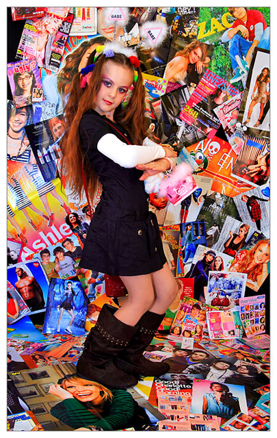
Now this looks like it took some real effort to put together. It's very relevant to the challenge which is good. Very colorful and clear. All of the text on the magazines is legible and your model was fantastic. Great work. Congrats.
I like it - the backdrop being SO busy and cluttered that it almost makes the model secondary is kind of an interesting comment on the overwhelming volume of media today and it's impact on how we are...
Wow, that's a fantastic image. The colours are jumping out towards you the way adverts and pop culture constantly does. And the image conveys a mass of social commentary along with it - the girl's thinness, the make-up, the boots, trying to grow up too quickly... And the horrible magazine cover with a girl with glasses and a big sign saying 'Ugly'...
10, and going into my faves.






 Add photograph to your favorites
 Add photographer to your favorites

 Photographer found comment helpful.


