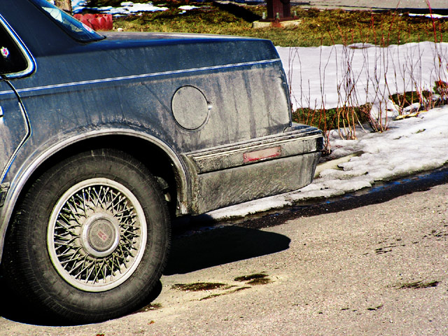
Levels, lots of selective color layers, and a chanel mixer layer, a contrast adjustment, and some burning, a gradient map layer with mask, and other stuffs.
I am hoping that the processing will appeal to people. I have always liked high contrast stuff but I wouldn't have thought to process this image this way if not for noticing this type of processing in other images. So I do hope this will do okay. I know it is of a bland subject, but we'll see how it goes.
Title is from "Stopping by Woods on a Snowy Evening" by Robert Frost.
post challenge: Oh dear. Well. I thought it was a kind of neat subject, at least.
Statistics
Place: 556 out of 561 Avg (all users): 4.0497 Avg (commenters): 3.2000 Avg (participants): 3.8908 Avg (non-participants): 4.5000 Views since voting: 1007 Views during voting: 238 Votes: 161 Comments: 7 Favorites: 0
I like your processing mostly because it looks very natural to me. Not sure about the composition, but I do like the idea behind it. I can't decide if less car or more car would work better.
I think you have a good idea, but the composition needs some work. It just doesn't grab me.....looks like just a snap shot for an insurance company or something.
Right then, joke's on me as I now have to plough through 564 images and bump them all (yes, all of them) up. There'll be a third run through for fine tuning.
And miles to go before I sleep... I see this as lacking in composition and theme, I'm afraid. I'm probably missing something. 4





 Add photograph to your favorites
 Add photographer to your favorites

 Photographer found comment helpful.


