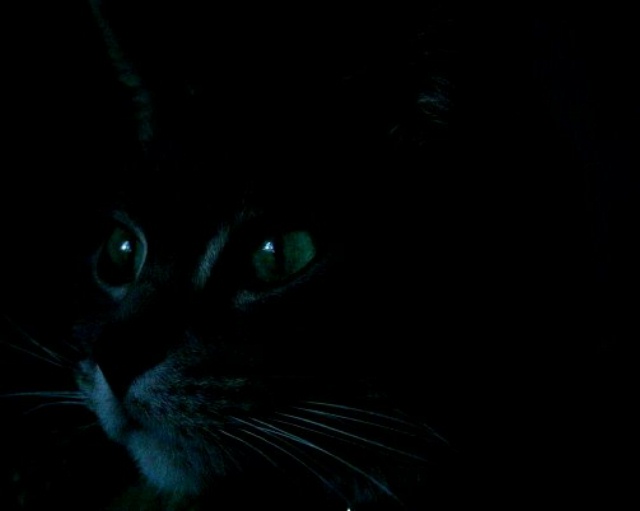
I like it! The framing is backwards, should be more dead space where the cat is looking but I like that too. I wish the highlights could have been just a tad bit brighter but I think it's too 'oof' for that. I can tell you tried to sharpen it (in the whiskers). I think if you had converted it to black and white and turned up the contrast you'd have achieved the desired effect you had inteneded? I might be wrong but I don't think the other voters will like your photo that much. Just in case, I'll help it along and go with an 8.
Great idea that fits the Still theme. I know some will complain
that this is a bit blurry, but I'll cut you some slack. It's pitch
black after all. An 8 from me.





 Add photograph to your favorites
 Add photographer to your favorites


 Photographer found comment helpful.


