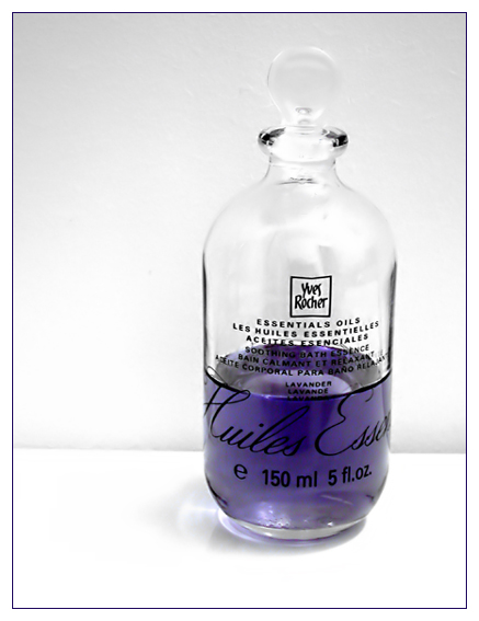
It's a good clean image and the lighting is good. Only negative is the background. I think ideally the back sheet needed to be farther away or else use one large piece of white paper. The line is fairly noticable, slightly 'dirty', and seems a tad tilted.
It feels unbalanced to me. The purple liquid gives it a strong base but there isn't enough contrast between the top of the bottle and the background. The shadows caused by the surface against the background are uneven and also pull the view to the bottom right corner.
Good clean simple color combination, pulls attention to the oil. Setup could have done with some more work in terms of background and light. A large piece of paper on the table and then moving up against the wall would have removed the visible transition. Some backlight might have given some more glow to the oil.






 Add photograph to your favorites
 Add photographer to your favorites


 Photographer found comment helpful.


