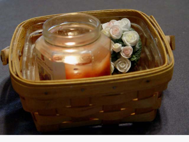
Not sure if you put the border at the bottom to eventually add some text but without the text (which isnt allowed on DPC) it looks kinda odd. The image itself is slightly blurry, possibly due to low lighting. The angle of the basket doesnt really add anything and so I think it would have been better straight. Cropping it so it has the same amount of space on either side would help with balancing up the image too. It does an ample job of depicting a scent/aroma.
What happened to the bottom of the photo? I like the composition, and the colours, the athmosphere of the photo. The bottle is too robust against the soft flowers and the basket for my taste. The light on the bottle is a bit distracting, too, is it the flash you used? I would have used another lightbulb instead, that wouldn't have left such a harsch light on the bottle, and front side of the basket wouldn't be in shadow. The idea is otherwise really good, only the performance could be improved a bit.





 Add photograph to your favorites
 Add photographer to your favorites


 Photographer found comment helpful.


