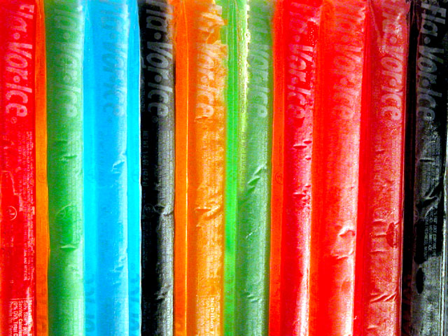
These look like they were frozen and when they were taken out of the freezer, they frosted up a bit and it's hard to read the labels. These definately remind me of childhood. My son eats these like they are going out of style. the angle and lighting are nice. you did a good job of keeping reflection and glare off the pops. You may have wanted to mix the colors up a bit. I'd like to see another one of those blue ones seperating the 3 reds on the right. The blue one almost seems to glow. If you haven't seen it already, you might want to check out guybrowme's "Cool, fruity, fun" photo in the Advertisement challenge. Kind of similar to this one. I like them both. Great job and good luck in the challenge.
yum.. i think something is kinda funky with the lighting here. Maybe too much glare in spots, though I'm not real sure. I like the colors though. karmat
Abstract.....cool idea....get it? "cool"?? I kill me..lol. Overall I like the idea...I think it'a a little too something though...I can't put my finger on it. Maybe it's just the light distracting me and not enough contrast....but I really like the idea. kdj 6
Good attempt - I like this photo. Have you tried the same set-up but with illumination from behind? I think that may be better in bringing out the coulours and eliminating the shine of the plastic wrapping.
my memory is "otter pops" same thing.. didn't have the black one.. but yes !! memory .. making me crave one right now :) the lighting is a tad harsh, maybe more natural light would have been good. 6
I like the colours. I can see the childhood element. So what is missing ? Maybe a focus point ? Or a diagonal ? I don't know and I'm sure one of the better photographers will tell you. Good luck.





 Add photograph to your favorites
 Add photographer to your favorites


