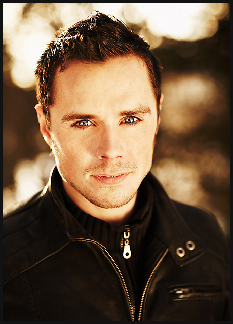
Well, once again just submitting for my WPL team. Spent no effort on this on behalf of dpc as I didn´t take this shot with the challenge in mind, actually had 5 photoshoots to chose from this week so the hard part was to pick one of them, not to take one. Could probably have chosen a more "dpc friendly" shot but I kindof liked this one.
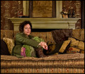
His name is Birkir and not James, thought I would at least try to throw people off a little bit by using an english name. Chose James as I told him to think like James Dean for the duration of this shoot. He´s also in another challenge or the middle guy in my crossdress entry.
Lit with two reflectors, one from each side and ambient light. Processing very minimal, just raw conversion, a little healing brush, very slight dodge/burn and added frame and sharpened after resizing.
Statistics
Place: 24 out of 268 Avg (all users): 6.4461 Avg (commenters): 8.0833 Avg (participants): 6.1980 Avg (non-participants): 6.6893 Views since voting: 2748 Views during voting: 370 Votes: 204 Comments: 18 Favorites: 3 (view)
This is a great shot. I have pretty much given up on this web site and the users abilities to rate images. You get a snapshot of some kid blowing out candles or something and it wins over shots like this. Just had to let you know it was awesome.
As far as a portrait goes, I think this is pretty darn perfect. The sharpness is fantastic, the bokeh is beautiful, and the composition and the pose are great. I'm wondering if users will not be appreciative of the fact that there is very little tonal contrast in the image; it's almost a sepia picture with the exception of the eyes and slight magenta in the lips and face. While I'm sure that's the intent (it certainly brings the focus in on the eyes), the rules specifically state "no sepia!" and I hope people don't revolt as a result. :-) I will say that the eyes do feel a bit overprocessed to me, which seems to be a trend among a lot of the color portraits here. I think there is something to be said for a more natural feel, which leaves the viewer with a more genuine appreciation for the photo. Also, be careful of burning highlghts in post, as the whites become dull and grey, and again not as realistic. Areas that are already blown out don't benefit from burning as there is no detail to extract from the area, and it's my opinion that it's OK to have blowouts in your shot if they are appropriate! That being said, I think it's a really nice photograph and one of my favorites in this group. Good job.






 Add photograph to your favorites
 Add photographer to your favorites

 Photographer found comment helpful.


