As everyone has already stated - an absolutely stunning shot. Thoughtfully relevant to the challenge title. I am now off to review the other Scents & Aromas challenge entries because I cannot believe there were 17 submissions better than this one!
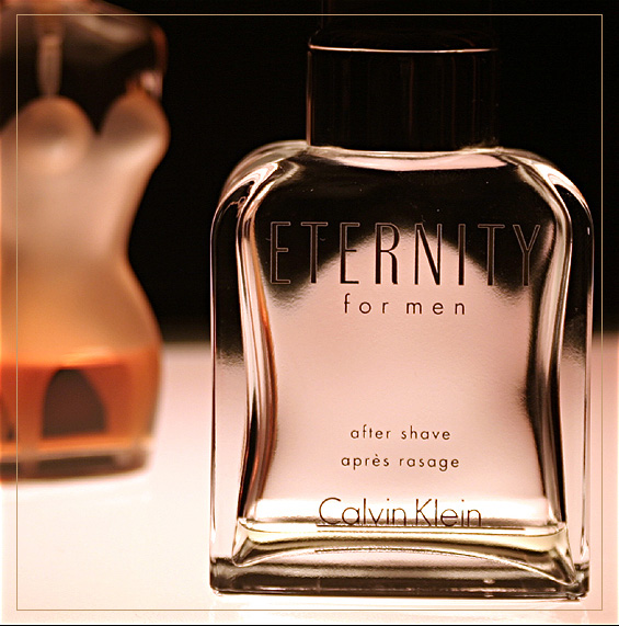
Looks like an advertising campaign. The focus on the front bottle is good, lighting is wonderful, the cheeky bottle(?) in the background adds a sense of fun and sensuality. I even like the border on this. Cant really see anything I'd improve. Very professional-looking shot, well done.
Composition and lighting are good. This looks almost like an ad in a magazine. Definately applies to a scents and aromas challenge. The frame / border is good - I think it adds to the image. I like the 'woman shaped' bottle in the background - excellent idea. My only pick is that the Calvin Klein bottle appears ever so slightly tilted in the frame. Nice Work :-)
this is a great idea but the single most distracting thing about it is you can't read the product name very well. Try taping a small piece of white paper behind the bottle (if you do it well you can't see it at all) and the label will be clearly visible.
Love the clarity, the soft colors, and the female bottle in the background, and how that one is lit to emphasise the female form. Nice and clean as well, no disturbing reflections, good symmetry of light in the bottle, spray hose in the bottle removed. Small thing : it could use a 1 degree rotation anti-clockwise.
I think this is such a cool shot. I love the bottle in the background. Obviously a ladies perfect bottle. The look of the bottle is perfect for this. I love how you've focused the attention on the 'man' leaving 'her' blurred in the background. It's almost like 'she' is courting him or something. I dunno, maybe I'm reading more into than you had intended, but I love this! The only thing I see a little off with this is the aftershave bottle. It looks tilted when you compare it to the verticle border on the right. Very minor, though. I gave this a 9!
Nice idea, well worked out compositon.
The only dislike is the way the background is refracted in the bottle, it takes the masculinity of the Eternity botlle away. It could do with a bit more saturation. Perhaps the Eternity bottle could be angled slightly more in a straight line to the lens.
Very well done. I like the toning. Sharp. This is the second border I've actually noticed this challenge. I'm thinking it's out of place because this looks like an ad and they are usually not framed.
Excellent picture. Good composition, light and DOF. I like the object with the form of a woman on the left. Great colors. Excellent work. One tiny thing is that the image seems to bit tilted to the right a little bit.
Very sharp shot. What I like about it best is what is not in focus! Adds a bit of question to the composition while the subject still gets my attention for it clarity.
Nice DOF, lighting, color. Very miniscule thing I noticed but shouldn't affect the rating at all is that the bottle is almost empty. I'm probably too used to seeing product photography of this type where the bottle is full. Great work! 8







 Add photograph to your favorites
 Add photographer to your favorites


 Photographer found comment helpful.


