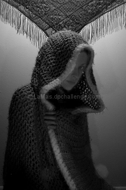
I had taken this with a tungsten light for background highlight to add depth. Small candles in the front of the subject were to highlight the face and to the cloak. In Photoshop, I corrected the contrast, levels and changed the color to black and white.
Statistics
Place: 113 out of 159 Avg (all users): 5.0737 Avg (commenters): 6.0000 Avg (participants): 4.9302 Avg (non-participants): 5.1156 Views since voting: 806 Views during voting: 315 Votes: 190 Comments: 13 Favorites: 0
I have only just found this image and have to say I like it a lot. The only thing is the shawl in the background is very distracting. The softness works well with the flat, low contrast lighting. I like this image so much that if it were mine I'd spend the time to edit the shawl from the picture, because without that it would be fantastic.
I did like this shot- but when I got it onto the computer I realized how out-of-focus she really was. The problem I had with this is that it was a timed exposure to really pop out the back wall and her with as little light as possible. BUT, no person can truely stand absolutely still for 10sec unless your a trained manican(however you spell it).
But I like the feel and I going try to magnify that throughout my entries.
Your comments truely are helpful. You are helping me to redifine my skills and to help me catch this that aren't so obvious.
First of all - welcome to the madness of DPC challenges.
This is a very interesting image. The first striking thing about it is the wealth of textures - the walls, her cloak, the rug above her head. The depth of field works well for this.
The composition isn't necessarily very DPC friendly - the conventional thing to do is to make the subject very much the focus of the picture, and steer clear of any distractions (like the rug above her head), unless they're directly complementing the subject. However, the fact that it's unconventional makes it interesting.
The other obvious DPC objection is that the face isn't in focus. Again, I'm not convinced it's a valid objection. The voters have a bias towards very crisp, clear images, but in this case the soft focus and shadows on her face make it look quite mysterious, and are possibly complementing what you were trying to achieve with the photo.
The white spots in the lower right corner are quite distracting. I know these just randomly happen, to the best of my knowledge, the only real solution is to take lots and lots of images, then pick the ones that don't have such problems (I've taken anything up to 300 for a single challenge).
In terms of the post-processing:
I would've cropped a small part of the bottom of the picture to get rid of the white line in the right corner. The best way to get exactly the relations you want between the blacks and whites in the picture is to use the 'curves' function in Photoshop, which might potentially improve the picture. Also, I don't know what you used to convert it to B&W, I find the channel mixer does a much better job than the 'desaturate' function, as you can get exactly the level of contrast you want by playing with the percentages. Also, the image is 620px high, which is close to the maximum, but you might as well use the full dimensions allowed - the bigger the image is, the more of a chance it gives the viewers to appreciate it.
Anyway - hope this helps, and keep on entering challenges!
Found the shawl to be distracting near the top, and focus is way off. Lighting for texture would have been better. Light to the right, higher than camera height and reflector (tinfoil can be used) needs to be played with to cast just the right amount of light to catch the texture of the fabric.






 Add photograph to your favorites
 Add photographer to your favorites

 Photographer found comment helpful.


